Showing posts with label Dala Polyurethane Hard Varnish. Show all posts

Tuesday, August 13, 2013

Distress Paint: Alchemy – turning cardstock into Vintage Gold


POCKET LOCKET FINISH2
I have been busy in my apothecary creating a fast and dirty formula to create a vintage forged gold effect.  I am going to share that with you today.

Now you can watch me perform alchemy in the lightning speed video below,  however in solidarity with my people (since South Africans generally are inflicted with the curse of slow, expensive, data-capped internet) – I am also going to share my magical formula in the step by step picture tutorial underneath it.

(edited to add – something went wrong when I tried saving the video – it is cutting all the video frames in half – don't know why – you’re stuck with the pic tutorial then! 
2nd Edit - apparently this is a bug well common to Movie Maker 2.6 devotees like myself who try to run it on newer Operating Systems - boo - I think I have lost my favourite editing tool but more importantly I am going to have to reshoot this whole video)
STEP ONE
momdadalicejosh 004
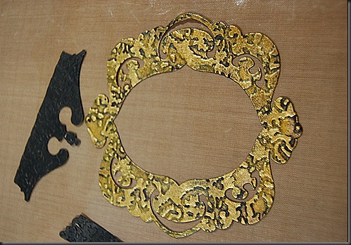
Cut out your pieces – I have used the Tim Holtz Alterations Clock Key and Pocket Watch die and a circle die from Spellbinders to cut out the window face with the intention of turning it into a pocket locket. 
  momdadalicejosh 001
STEP TWO
Create the background Patina by covering the whole die-cut with an opaque coat of Black Soot Distress Paint (DP – from now on) – this is very important in crating that vintage feel - so don't skip it. 
momdadalicejosh 007
STEP THREE
Choose the embossing folder pattern - I like to use something with a highly detailed pattern as it gives me more texture, and more texture makes the piece look more vintagey. So I chose the Sizzix Alterations Damask Folder.  Run it through your Embosser.
momdadalicejosh 030momdadalicejosh 008 
STEP FOUR
Dab a glob of Tarnished Brass DP on your work surface or craft sheet and using the blending tool with the the foam applicator, gently begin burnish the embossed bits.  The trick here is to apply very light pressure in a staccato or brisk up and down motion.  Keep building up layers .  I prefer to highlight the embossed bits heavily in the Tarnished Brass DP but leave the debossed bits, slightly less covered in paint so some of the Black soot shows through.  This is what is going to achieve the vintage patina effect.
 momdadalicejosh 030gilded1 
STEP FIVE
The next step is optional.  To create the gleaming glint of vintage gold – over the Tarnished Brass DP rub on some Gilder’s Paste or Perfect Pearls. This has a two-fold effect – it blends and evens out the sponged on paint and the gold particles settle into the debossed areas such that it matts everything out but at the same time adds more gleam to the “precious metal”
gilded2 blockprints trinkets 023

STEP SIX
To finish it off or seal it – there are three things that you could do.
You can coat in Ranger’s Glossy Accents – this looks super shiny and slick.
blockprints trinkets 024

Or you can heat emboss it with CLEAR embossing powder. Don't use gold embossing powder because you will lose all the cool dry embossed detail.
locket locket back
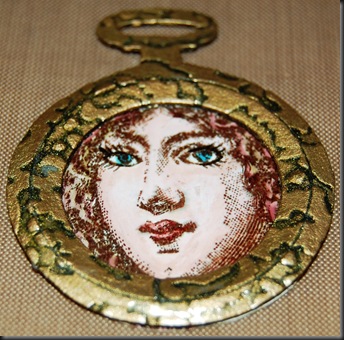
Or you might just want to take the fast and dirty way out and either spray clear lacquer varnish or paint high-gloss varnish onto it.  Which is what I did for the pocket locket – The heat gun was a little too fiddly for me and I didn't want to leave my chair – and that is the primary reason why I chose this method over the other.

And there you have it – You’ll be turning pieces of paper into gold in no time at all.

A few other details about this project – the stamp is from a South African company called Heritage Stamps, though I have to admit that I did tweak her eyelashes and put on more eyeliner for her..  I stamped on Ranger’s Specialty Stamping paper and I coloured the image with Ranger Distress Markers.  To create the vintage glass feel – I gave the face window a generous coat of Glossy Accents.  Once that dried – I decided it would look cooler with deep cracks in the glass, so I overcoated that with crackle accents.
heritage stamp momdadalicejosh 026 POCKET LOCKET FINISH1
I still haven't decided what I am going to do with my paper gold pocket locket.  Maybe I could swing it off of the top of a tag and turn it into a bookmark.
In the end after all the tweaks this is what it turned out like.
POCKET LOCKET FINISH3POCKET LOCKET FINISH BACK  

Wednesday, May 29, 2013

Some Tim Holtz style techniques and masculine cards


I always have a hard time trying to make cards and gifts for guys.  Even when you do a search for inspiration on male-themed cards your returns are standard fare – military, sailing, cars or tools right?  Does a masculine card really have to be limited to  neutral or muted colour palettes?   Are they really loving those golf-themed and fly-fishing efforts? I think we need more guys in our cardmaking circles to give us some kind of direction in the way of new themes for guys.  Luckily for us we have steampunk and grunge to shake up the mix a little – there are after all , only so many times that you can re-interpret a golf-ball image.
I thought that I would share with you an idea that I had for a unisex card.  I got to use one of my favourite paper-altering techniques (inspired by Tim Holtz of course) on it and my favourite hot-air balloon stamps.  I have never actually been up in a hot-air balloon, there is that pesky fear of falling out that I have to deal with – but I have always loved them.  So here it is – my attempt at a somewhat fun, colour-popping card that you could send to a male member of society, with the added bonus of a colour scheme that doesn’t rely heavily on dark muted tones.
 blogcards 031
For the background I used a piece of light blue cardstock, pulled out a bunch of my favourite balloon stamps and used a masking technique to stamp the images.  (NB:  make sure that you masking glue really is masking glue because I didn't use masking glue and one of the masks got stuck to the top balloon and ripped some of the upper layer of paper there).
blogcards 021While the masks were still in position I stamped over the masks with the clockwork machinery stamps in Sepia Archival Ink and then over that I layered some text stamps from a Chiswick collection.  I then used  Distress ink in Salty Ocean, Tumbled Glass and Broken China to add more depth and contrast to the blue background.
blogcards 022 blogcards 016
I removed the masks and used Distress markers and Watercolour Pencils to colour in the balloons – This really made the background pop and contrast.
blogcards 031 blogcards 024 blogcards 029
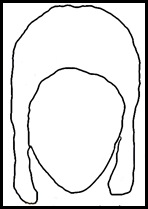
  Getting the pilot hat right was kinda silly –I took a couple of pictures of myself  in a long-eared beanie with my webcam to give me an idea of how  a 1940’s pilot hat would fit on a head.
Picture 39   Using that as my blueprint I did a rough sketch on Gimp to make it look more like a Biggles pilot hat and aviatorhatthen saved that outline to use as the cut-file on Make-the-cut (MTC from now on).  With MTC you have the option of pixel-tracing a JPEG and it converts into an SVG file ready for cutting on any plotter. I really like using these two programmes together.  If you do a search for Gimp brushes you can get a whole lotta images that you can use as digital stamps.  Once you import those into MTC – you can do some cool print and cuts with those saved files as well.
I used a Ranger product called Ink Refresher.  Tim Holtz demonstrated the potential of this product to create a leather look.  I originally used to use acrylic retarder to get paper supple and oily and leather looking, but I bought a bottle of this stuff to refresh my ink pads and decided to try the leather-look texturisation.  I was surprised – I had not expected it to work, feel and look any different to my acrylic retarder leather-look technique but I have to tell you – this product works so much, much,much better.  It makes the paper feel like soft suede and when you ink it for highlights and lowlights and crack burnishing it takes the ink really well without shredding the paper.  I love it.  To give the hat a little more worn and polished look I painted it with a clear acrylic varnish.
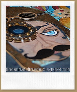
  I played around some more in MTC and drew some goggles and a couple of gears and a cool twirly moustache.
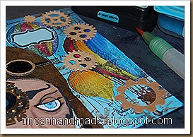
I drew in an eye, nose and mouth to the face and then added some steampunkery to the left side of the pilots face – I cut some of the gears and cogs on the card with regular dies (I think they were from X-cut – not sure now what brand they are because I store them unlabelled altogether)  and I cut the eye glass gears on MTC (you can make your own gears just by creative use of their inbuilt shapes and shape magic tools).  I stuck acetate to the back of the goggles and then poured in goopy White PVA glue and then coloured on top of that with a black permanent marker.
blogcards 025 blogcards 026blogcards 031 

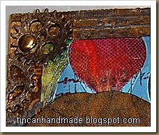
I cut out a rectangular frame and embossed that with a couple of different blueprint, industry and cogs and gears folders – I painted over that with gold and black acrylic paint and then ran some brushed pewter distress paint over it to make it look tarnished and brassy.
blogcards 031
I die-cut “WILD RIDE” out of the the Alphablock strip die from Tim Holtz alterations and stuck the R-I-D-E on a narrow chocolate popsicle stick.  Excuse the undried glossy accents there.
Here are some freebie cut files in MTC Format if you want to try make this pilot too!  I had to split it into 2 mats - It only contains the SVGs for the eye gears, the face, the hat and the goggles( all in multiple layers so you can stack them for dimension).  You can fully customise the face by drawing it in yourself and the background etc is up to you. If you want these in another format – shoot me a comment and I will see what I can do. 


Monday, May 13, 2013

Cards, cuts and the amazing things you can do with MAKE THE CUT


On one of my pin-surfing trips this weekend – I found the most adorable French dresser type card that I instantly fell in love with.  http://pinterest.com/pin/78461218478519460
And Mother’s day was coming up and I still hadn’t made a card for my mama by then.  So I decided that this would be really cute to do and that she would love it because she’s a dresser kinda gal.  It was too cute and I had to try my hand at it.

Anyhow, I didn't have any cut patterns for the dresser so I turned to my favourite cutting programme ever – MAKE THE CUT and designed my own super cute French dresser with drawers. 
th & mothers day 017 (2)eI think I have  worked out how to  how to host and link a downloadable file on blogger (much love to Lindsay from the http://thefrugalcrafter.wordpress.com/
for showing me how to do this) – I am  making those cut files available to all you cool readers of this blog too so that “if you get the feeling” – you don't have to spend an hour searching for a cut file and then suddenly realise that you could just do it yourself on MTC, then spend another half hour drawing that.  It will hopefully be available right here:

- MTC Project file  Download link -
http://www.4shared.com/file/wSBrBGnr/french_dresser.html

- Plain SVG Download link -http://www.4shared.com/file/wSBrBGnr/french_dresser.html

If you don't have MTC or a digital cutter (which you really should if you don't because it is so stinking brilliant).  I am going to try and save the images in a PPT so that you can print and then cut out by hand – the layers are all so simple it is totally cuttable by hand even with those big, clunky round ended toddler scissors.  You may be able to find those here:
  
 - PPT Download link -

 http://www.4shared.com/office/ywj3h8gm/ppt_dresser_cut_files.html.  

Someone let me know if these links work please.

There are way too many cute ideas I have in my head right now that I could use this basic cut file for.  How about a mirror stand and some chairs?


I used a digital cutter to cut out the layered pieces,I cut it out of Flexoid – which is oil resistant gasket paper sold at a autoparts store.  My dad actually turned me onto this when he saw my grungepaper, and thought it looked really similar to gasket paper.  It doesn't work as well as grungeboard (being that it
wasn’t particularly designed for crafting, or to be be pretty) but it is a pretty decent second and I can buy it by the metre, which for me is like a present – I am a ridiculous bulk-buying freak.


th & mothers day 010
Anyhow, once I assembled all the layer pieces together – I stuck some acetate on the inside of the folded window pieces and then applied a super generous layer of Dala Hard Polyurethane varnish and Glossy accents -   I sort of wanted it to look like thick bubbly hand-blown vintage glass.  It didn't turn out the way I imagined but I wasn’t entirely displeased with the final effect.


Just before I folded the window layer – I painted the inside piece white with a light blue tint.  I then varnished the whole thing with Dala Polyurethane Hard Varnish.  It reminded me of those old cabinets and things my granddad used to have lying around.  My granddad was a carpenter and there were always crazy, cool things about his house, including various bits of furniture and pianos that he used to restore.

th & mothers day 012e

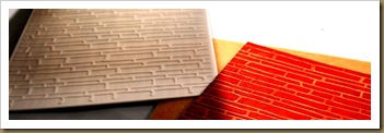
To make the background I used one of my favourite new Spellbinders M-bossabilites embossing folders that I got a few months ago.   They are dual textured embossing folders.  You just flip it depending on which texture you want.  This particular one is my favourite – it has a bark/woodgrain texture on one side and brick texture on the other on the other. Their designs are so rad.I distressed inked that in Fired Brick (naturally!) The hue of the Flexoid paper is sort of halfway between Kraft and Manila Tag, so the debossed contrast of the “plaster”is just perfect.    
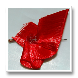
To add a little dimension – I sort of pleated and fanned out a teeny piece of red silk ribbon to make the burlesque-y secret spill out of the drawer.


I stuck a sewing pin through it to hold it in place and give it structure then poured on super glue to seal it. 

I used the wire cutting bit on a set of pliers to snip off the head and the point of the sewing pin.

Then I just super glued that down – I used some Chiswick adhesive foam squares to pop the top drawer out a bit over it.

For the assembly of the card, I folded a piece of kraft card stock, stamped all over it with one of the new line of Chiswick clear stamps in sepia archival ink and then cut a piece of black cardstock to provide the sandwich contrast between the fired red brick and and the neutral background of the kraft base.
  
I used the We-R-Memory Keepers Stub and Deco punch to clean up the corners and stuck those pieces together with snail adhesive from Crafter’s Companion.  I really like Crafter’s Companion adhesives, including the spray adhesive – It’s pretty strong and its reliable – I feel like I never have to worry about the nozzle gunging up or the snail runner slipping and stuff. 


The inside of the card was not too spectacular – I tried to keep it primitive – I’m afraid my obsession with gears and iron and steampunk love never quite left though – even though I tried hard to keep it in check.  Here is the crazy inside – just a few scribbles and I also wanted to test out these new Bic (kokies, if you’re South African – markers if you’re not) that I got at Dischem (???!??!) that have “INK EATER” markers.  I thought it might look kinda cool to have a zebra type print going on with the lettering – it was passable, it turned out looking much more doodle-sketchy than I intended….oh well…wasn’t that bad though.

I cant wait to play around more with this look.  I loved the contrast of the red brick and wood.  I think just a window with a funky blind against that brick background might also be pretty rad. The whole think made me think of those cool  old warehouses remodelled into bohemian apartments, that you would find in like New York, habitated in by hipster-trendy art people.   The  best part was that my mom loved it – I didn’t even put it in an envelope – I just had it hanging out on the front of the gift bag and it looked like it was suspended by the MOM bunting as well.  Super cool all around. 

So anyway that is it for now.  I’ll see what I can do about trying to upload the cut files.