Showing posts with label Distress ink. Show all posts

Thursday, January 1, 2015

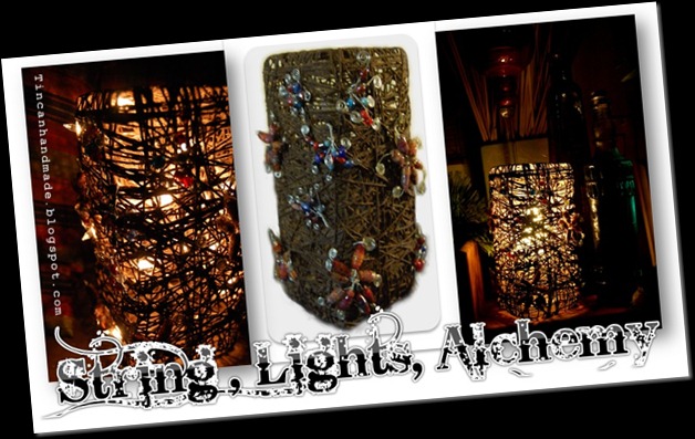
STRING, LIGHTS, ALCHEMY!!!! - Our Creative Corner January 2014 production -


I am still celebrating having made the design team over at OUR CREATIVE CORNER for this year and I am so amped (pun intended) to present a little tutorial for my stringform lamp project that I created for the January 2014 challenge.
Untitled


If you haven’t already come from there – why don’t you click the image on the right to browse through the creatively diverse projects created by my fellow Our Creative Corner banneruber-talented teamies, you will also be able to see the challenge entries created by the readers themselves.  
The Challenge this month is hosted by Pamellia of my little craft things and this is what she says: 
"With the holidays merely a shadow behind us, my guess is you still have bits of Christmas leftovers stashed everywhere, not to mention bags of Christmas bits meant for the recycle bin. I am a hoarder of all things I think I might get around to using one day, and Holiday bits are no exception! Every closet, drawer and cupboard is overflowing with the little things I collected throughout the holidays. Things I think I might use and things heading to the curb.
Christmas wrapping, gift bags, tinsel, ribbon, gift boxes, tissue paper, Christmas crackers, wine boxes, empty gift wrap rolls, Christmas cookie tins, even the images from the fronts of cards I received...you name, I hoard it!
Let's put those bits to good use this month!
With that in mind, for my introductory challenge theme, I have chosen........
CHRISTMAS LEFTOVERS
To be clear, your project does NOT have to have a Christmas theme, I only want you to recycle your Christmas scraps.
If it's not obvious what Christmas leftovers you used, make sure to tell us about it, somewhere in your post."
And there you have it.  There are prizes to be won sponsored generously by http://nicecranedesigns.com/, so be sure to get in on this action and make your own project, if creating something is not reward enough.  If you still want to stay on this page, dont worry clicking the image will open the link in another window. 


Find the tutorial for the string form lamp underneath this banner.


For this project you are going to need the following raw supplies:
*Cotton Twine or String – the amount depends on how much you want to wrap around your object.
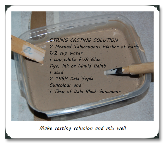
*White Glue,
*Plaster of Paris or Casting Stone Powder,
*Water,
*Paint, Dye or Ink.
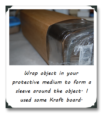
* A protective medium like newsprint or lightweight packing cardboard,
*Clingfilm. 
*An long, rectangular object like a spaghetti jar or a rectangular vase. 
*Some bits and bobs or 
*Wrapping paper to make the Embellishments,
*UTEE (Ultra Thick Embossing Enamel),
*Glossy accents or Dala Polyurethane Hard Varnish to seal the embellishments. 
*Wire (if you are going to make Wire do-dahs).

STEP ONE
Gather supplies.


STEP TWO


STEP THREE
Cover your work surface in plastic wrap and then newspaper – this project is MESSSSSSSSYYYYY.  Put on some gloves as well.


STEP FOUR
When your string thing is dry to the touch and firm against pressure – you may begin the unmoulding process.
  • This however takes some creative figuring out.  Take a strong scissors and evenly cut away the top or mouth of your wrapped object.
  • Using firm but gentle pressure, pull the inner object (the glass jar) out of the sleeve covering it first!  You are going to have to wiggle this one out.  Be patient – it eventually gives and slides out
  • Using a chopstick or pencil – gently push the the sleeve towards the centre and pull out through the mouth you just cut. If you didnt cover the sleeve in cling film, the glue would’ve stuck to the sleeve and that would have been a mission to tidy up all the ripped pieces attached to the string form.
  • Pull away the Clingfilm from the String Form.

WHAT NOT TO DO.

  • I initially covered the jar in Clingfilm, then sleeved, then clingwrapped again.  This made pulling the jar out near impossible. The inner layer of clingfilm just kinda bunched up and resisted the pulling force.
  • I had to pour loads of talc in between the inner film and the sleeve to get it out eventually, and so my moulded string form got covered in talc as well…
I solved this snag, by dusting off as much as I could with a soft paintbrush.  I then soaked the same brush in 2 parts Sepia, 1 part Black, 0.5 part white Dala suncolour and brushed that over all the spots that were still covered in talc ash.  I let that dry and my problem was solved.

STEP FIVE

lampday
lampdayYou can now add embellishemts to the outside of the string form if you want. 
I made some paper beads from leftover wrapping paper. I dipped those in melted Ultra Thick Embossing Enamel to get that glassy effect.  I also had some glass beads on hand. 
I made a few curly wire forms and threaded the beads onto that and attached the embellishments to the outside of the lamp. 
daylamp


STEP SIX


DSC_0328Get those Fairy Lights that are tangled beyond help, and stuff them into the String Form, making sure that they fill the whole form from top to bottom.
You can do what I did and had a few bulbs sticking out through the little spaces between the string wraps.
Plug in and love your new decor piece and tell everyone you made it all by yourself!!

Let me know whether you liked this tutorial and whether you were able to make one yourself in the comments below or even better on the January Challenge Post over at OUR CREATIVE CORNER
You also are going to adore all the gorgeous little goodies on offer by the sponsor for the month - here is a link to nicecranedesigns 
~hugs, light and love~
Candice (aka Tincan)

Tuesday, July 23, 2013

12 Tags of 2013 – July Tag – 67 minutes

TH0621023 327  I didn’t think I was going to enter the challenge this month.   I was really stuck for inspiration – we don’t celebrate the 4th of July (being South African and all) and I have been saving all my tags with the intention of eventually installing them onto a collage of sorts to hang on my bedroom wall.  So I reckoned a “ US Independence Day/freedom” type tag would be a little lame and weird if its going to hang on the wall of this  “makhoti”  in Kwazulu right?  

Anyway I went about my business, messing around with all kinds of other projects, but I think if I don’t do something Holtzy I get a bit anxious and fidgety.  I swear I think I’m Holtz junkie. 


So then the 13th of July rolled around which is my birthday and I got a sweet horde of Holtz-aphenalia….which I generously gave myself as a birthday present,everybody should save up all year to do one big bank-busting Tim Holtz buy for their birthdays right?  In addition to that – I received an order from Inspiration Emporium.  And you know how that goes – once you get your stash, it takes an extreme amount of self-control and pleasure delaying to stop yourself from wanting to play with your goodies….

TH0621023 311

Inspite of the haul and the intense desire to cut, copy the July theme, and paste ideology charms and adornments I was still stuck for an idea that would fit somewhat with the theme. 

Then the 18th rolled around which in my country is celebrated as Mandela Day as it is his birthday.  This year he turned 95.  The celebrations were less pomp and festive than usual as he currently lays gravely ill in hospital.  As we collectively held our breath for news of his wellbeing, an idea started forming in my head.  Yes we don’t celebrate American Independence Day but we do have a new and very worthy July tradition  - the 67 MINUTES tradition.  The concept of 67 MINUTES is a pay-it-forward sort of deal.  

In recognition and honour of the 67 years that Nelson Mandela (known affectionately in my country as Tata or by his clan name Madiba) selflessly served in the aim of greater good, we give 67 minutes of our own time to do something good, charitable, courageous or gracious.  Madiba being such a genuine example of humility, benevolence and grace – asks that the day be marked not by some kind of reverent worship or adoration of him, but instead be marked by your own 67 minutes of good deeds on this day.  I think this is an awesome way to honour a man that I have utmost respect and gratitude for.  And that is what jump-started my idea for the July entry into 12 Tags of 2013 challenge.


The concept was “freedom” in a sense.  The idea is that doing something good frees your soul.  I also wanted to share the idea of the 67 minutes challenge.  One of the other great gifts I received this yeas for my birthday (from someone else this time) was a copy of a book called “The Secret”.  The ideas contained in this book speaks to the power you have within you to attract that which you desire if you are in alignment with the Universe (It is lot less hocus-pocus-chant-Aum-gaze-into-my-crystal-ball-New-Age-magic-sparkle-unicorny than I am making it sound).  

The basic premise of the movement is that within the universe there exists a law of attraction – like attracts like.  It espouses that the Law of attraction enables you to call goodness into your life by just focussing on it, wanting it and envisioning it.  

If you persist in negative thought patterns, you by default invite negativity, if you dwell on positivity you by default attract positivity.  Your thoughts are your intentions.  You cannot change the outlook of others but you can change your outlook.  


I thought about what I most wanted in my life (I always thought it would be unlimited credit at Ranger)  but it turns out that what I want more than anything else is to love unreservedly, be good and be surrounded by love and goodness.  I want to challenge myself to spend at least 67 minutes of each week doing something constructive, positive and benevolent.  


The book offers a tip on how to bring this into conscious awareness and thereby into conscious manifestation by advising that that you should try putting visible reminders of what you want up where you can see them.  What better visible representation of what I want and hope to be than a pretty tag that reminds me of the 67 MINUTES challenge?


If you know my style at all – you will see that I have deviated from my usual style which is often dark, moody colours with jarring eye-poking contrast.  This month’s tag is a little lighter and softer – I worked a colour palette that I have never felt at home with before – a kind of sorbet,pastel palette.  This already might be the effect of the law of attraction in operation.  I am starting to feel lighter, my heart is starting to feel softer, less anxious and not so at odds with the world and I think it is starting to reflect in my every day life, including my choice of colour palette.

Back to the tag - as always – here’s a blow by blow photo show of my whole process – even though it is not as super detailed as I usually do it. 

Background

I brayered on Distress Stain – in various colours and then over that in the opposite direction I brayered on White Picket Fence Distress Stain, Loved how it it toned down the eye-pokey.  Following Tim’s instructions, I random stamped incomplete images all over to make a pretty collaged background.
TH0621023 307

TH0621023 306

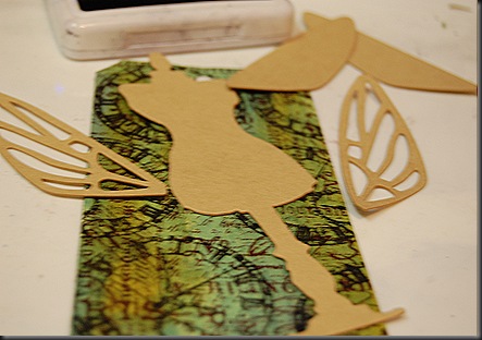
I used a couple of Alterations dies for this tag – Fanciful Flight, Sewing Room and the leaves were from the Tattered Florals Strip die.  I crackle-painted and baked in the Walnut Distress Stain on the wings – loved that porcelain look.  I also put some glow in the dark paint on the outer wings – this is both cool and a little creepy when you turn the lights off. 


TH0621023 296
TH0621023 324
TH0621023 316


The flower on the bottom left is a tissue tape flower. I used a variety of different tissue tape on this tag. TH0621023 329 

The quote comes from one of the Visual Artistry Clear Stamp sets.  I thought it was perfect – Madiba himself achieved the somewhat impossible by his dream of being more.  I stamped on Vellum, heat embossed and then used Distress Ink and Stain to colour the vellum.  I Distress Stained the little strips behind the sentiment.  Those cool strips are so awesome, they used to be a window blind, I cut it up, cos I am a rebel like that.


 TH0621023 332


I attached the wings to the dress-form with brads, added the INSPIRE token – I kinda wanted it to look like a medal as if  your 67 minutes that you give frees your soul, you “win” by inspiring kindness in others as well.  

TH0621023 334

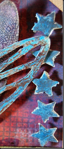
When I was little we got “stars” if we did something right or good, they represent the same concept – I crackle-painted and glossy accented those.  They were so tiny though, your fingers get a little crampy, and you get a headache from trying to get your aging eyes to focus so while the awesome grungy end might justify the physical trauma of method - I am going to have to admit that it took effort and supreme determination to stay committed to that effect. 


 TH0621023 316 TH0621023 314


I ought really to go to bed now cos it is 3am and I have two classes to teach tomorrow.  I hope that you were inspired to act on your 67 MINUTES as well.  I love this quote by Marianne Williamson (often erroneously attributed to Nelson Mandela’s Inaugral Address btw) – I am going to end this post with it.

"...Our deepest fear is not that we are inadequate.
Our deepest fear is that we are powerful beyond measure.
It is our light, not our darkness that most frightens us.
We ask ourselves, Who am I to be brilliant, gorgeous, talented, fabulous?
Actually, who are you not to be?
You are a child of God.
Your playing small does not serve the world.
There is nothing enlightened about shrinking so that other people won't feel insecure around you.
We are all meant to shine, as children do.
We were born to make manifest the glory of God that is within us.
It's not just in some of us; it's in everyone.
And as we let our own light shine, we unconsciously give other people permission to do the same.
As we are liberated from our own fear, our presence automatically liberates others."

- Marianne Williamson, A Return to Love -1992

Monday, July 8, 2013

Distress Paint Rust Effects - First Technique – TRUSTY RUSTY


  For the last month or so I have been trawling through all the TH0621023 123“Rust” pins on Pinterest.  It makes me feel good that other people also think Rust is beautiful.  I love how rust looks and when I started expressing this little fetish publically – I always got skewed looks.  So finding rust-loving pinners made me feel wonderfully accepted. 

  Of course for a paper-crafter – if something is beautiful, you have to find a way to emulate that on paper.  That is what I am attempting here to show today.  I have experimented with a variety of techniques, but this technique that I am sharing today is my favourite.TH0621023 284  I will be sharing the others at later dates on different posts.

  If you have Distress Paint, glue and some grit – it is almost too easy to do this effect as shown on the frame, accents and hinges card on the right. 

Today you have two options of getting the handle on this technique.  You can just click on the video below the text-tutorial and watch me demonstrate the process - or you can skip the video and just read the shortened cheat-sheet post right here with bonus pics and talk-throughs after it!

 Step one
Figure out what you want to “rust”. 
Even though I had that nice picture of a rusty pediment on the top there to show you how cool the rust effect is - for the purposes of this tutorial I am going to “rust” the posts from TIM HOLTZ ALTERATION’s Hardware Findings Die. 


Step two
If you want to – you can sponge on Rusty Hinge Distress Ink to create a rusty colour

Step  three
When tin or iron corrodes its starts to flake and bubble and get real gritty. 

To create the uneven surface of rusty metal - I put some glue down on the item – in the video the tube says Paint Appeal – but I just recycled the tube cos it has a nice pointy tip, and I have filled it heavy duty cold wood-glue. 

Now you’re going to need grit.  I bet you can use anything gritty – art sand, regular fine sand, even glitter flakes.  I took some fine table salt – blasted it in a coffee grinder to make it finer and then added Rusty Hinge Distress Ink (the refill ink not the stamp-pad if anyone is wondering how to do that).  I blended that in until I got a nice orangey hue.  This is optional because you will be painting over it anyway, but it is kinda fun to dye the salt.

The next step is to rub that on the piece that you have covered in glue. It doesn't have to be uniform and you dont even need to cover the whole piece in a layer of grit.  You just need enough to create some corrosion texture.

Step Four
Gather up all the Distress Paints you have with the colours that you want in your rust.  Usually rust has patches of ochre and red, orange and browns, sometimes a little blue-grey, sometimes even green.

For my piece I gathered up Barn Door, Rusty Hinge, Spiced Marmalade, Mustard Seed, Walnut Stain  and Tarnished Bronze.  I also got out the Weathered Wood for the oxidising finish.  I think Bundled Sage Distress Paint would be better but I dont have that yet.

Using your finger or cottonbud (Q-tip) or the “Tincan Tool” start creating your patches of corrosion by dotting/spotting/tapping the paint on and lightly blending it together.  Do this until you are happy with your rust pattern.

Step Five
The last step is giving it an oxidised look.  Rust that is outside in the elements sometimes develop a chalky blue-grey or green-grey oxidation, like how patina forms on brass statues or figures.  

To do that you just need a tiny amount of Weathered wood mixed with a bit Peeled Paint Distress Stain (If you dont have Bundled Sage Distress Paint like me)  or Bundled Sage Distress Paint.  Use your finger again to just dab on the tiniest amount here and there.  This step is optional but I really like how that constrasts with orange and ochre.

Step Six
This is another optional Step – but to keep the grit from eventually falling off etc, you might want to hit it with a blast of matt finish fixing spray.  I dont think its too big a deal though and you can skip this step.


So that concludes the technique bits – now let me show you the other cool bits of the card.

TH0621023 285

To get the metalworked Rusty effect –as in on the frame of the card – I ran Rusty Hinge Distress Ink all over a piece of cardstock and then embossed it with the sizzix alterations Regal Flourishes texture fade.  I applied a “rooibos” rust to the frame. Rooibos (literally translates into “Red Bush” in English) is a type of tea in South Africa that brews to a gorgeous red colour, I cut open a teabag, poured the contents into a coffee-grinder and mixed some of it into clear matt glaze medium.  The dye in the tea starts to migrate a little and this I thought creates a pretty cool effect.  I think you could use ground up Hibiscus Tea for this as well – it might yield a very pinky-red stain though.


The next cool thing I loved doing was faux pyrography.
TH0621023 289

If you dont know what pyrogaphy is – it is the art of burning designs into wood with a heating unit.  I tried to do this with that soldering iron I spoke about in my last post but I couldnt steady my hand enough to write legibly on the popsicle stick so I did the next best thing.  First I stained the popsicle stick with Rusty Hinge Distress Ink.  I wrote on it with an embossing stylus using as much pressure as I could to create an indentation without actually breaking the stylus.  Then I traced in the indentations with the fine tip of the Walnut Stain Distress Marker, I might hace also gone over with Black soot – I cant really remember – but defo on the Walnut Stain.
   TH0621023 291
This card is for a sweet old guy who had an accident on his farm while working and he was beat up pretty painfully, so he was in need of a get well card. I loved the idea of a fuse to fire up recovery. I go around looking for all kinds of things that people usually throw away.  This fuse came from the rubbish bin of a mechanic, one of my best random-scavenger-days ever. The Heart was originally a pastel pink button that I painted with Fired Brick, Barn Door and I crackled that and then rubbed Tarnished Brass Distress Paint all over it.  I painted White Picket Fence on the glass bit of the burnt out fuse and then tried to write:  “Love is the best medicine” on it – that was hard cos I had to write so microscopically – I am going to have to practise my fairy-sized writing skills.

I was really looking forward to using the map stamps that I have – they are pieces from a bunch of different sets.  I gave them the ol’ Distress Marker and waterbrush blending treatment.  So loved how it turned out. 

Alright, time to wrap up this post.  Like I mentioned earlier – I have experimented with other techniques to create rust, I will be posting other rust effect tutorials on these techniques as well.  I am also super keen on following through with my promise to deliver the forged-gold tutorial and the Stone-texture tutorial – all totally possible with just a few colours of incredible Distress Paint – bookmark this blog, follow by email or through an RSS feedburner to make sure that you get in on it first.

Thanks for checking this out.

Saturday, June 29, 2013

Once upon a time in Texas – Turn paper into Galvanised Steel with Distress Paint!

DSC00326 I accidentally discovered a pretty neat painting technique while messing around with Distress Paint.  It is so super cool that I can barely wait to show it to you. 

I have the good fortune of being loved and spoiled by a dear sweet lady who owns a few ranches in Central Texas.  Last year around this time of year, her son took me out for  a fantastic “off-road” trip all over one of their ranches.  It was there that I took this picture on the left.   There are so many good memories and feelings attached to this day that whenever I look at this picture it almost feels that I am drawn back to the delirium of that time – albeit now - a little more wistfully.

So since I am in a bit of a melancholic reverie - I have decided that I am going to create something inspired by this picture to demonstrate the process of creating a Galvanised steel effect on paper.  TH0621023 219

The element that I am going to be galvanising is that awesomely gnarly windmill.   

I drew/created/ made the windmill shape in MAKE THE CUT. I am going to also turn the old rickety barn and horse trailer into a “stamp” by tweaking it in GIMP. This is purely so that I have an excuse to do more Distress Marker-watercoloring. 


I am also going to show with you my cool new tool that I call the Tincan tool.  I am so convinced that it is the next best tool for everything that involves nickity pickety work that I am patenting it.

To create the galvanised steel paint effect:
You’re going to need Distress Paint in Black Soot, White Picket Fence, Weathered Wood and Brushed Pewter. 
  
You are also going to need some kind of applicator that makes a rectangular or square pattern because galvanised steel has a little bit of a cross hatched look as opposed to brushed metal or chrome metal. 

As you will  see in the video tut below– I also used the “Tincan tool”, which I will show you how to make and threaded on 2 foam squares – but you could just as easily punch out foam squares with a square punch or even just cut itsy bitsy teensy ones with a scissors….or a bush knife if you’re hard core like that.

 Here is a handy 3 and a half minute video demonstrating the process.

and a few pictures of the final project in the making –
TH0621023 184
I designed and cut out a windmill shape  on MTC -  see on the top right of this post for the finished galvanised windmill.


I manipulated the original photo (pictured at the top of this post) in GIMP and turned it into a stamp or colouring book type image (right).  I prefer to manually “create” the stamp in GIMP because I can manipulate the adjustments wherever and however I want it to be – for instance I want some areas less speckly and other areas sharper.  So GIMP is the best fit for me for this control-freaky reason.  However to get to a point where you can start tweaking like this is a bit of a learning curve, so if you want to skip all the frustrating figuring out - try Photoshop beause it has an automatic stamp filter, the old Windows 95 Picture editor(downloadable now as a stand-alone programme) can turn an image into a stamp.

laura's barn colouring


There is a free programme called Irfan View that also has a filter that will turn an image into a stamp.  The con is that you get an automatically rendered stamp filter that is not as “malleable’ as when you do it manually – layer by layer, pixel by pixel.  

I used Distress Markers to colour and blend in the image to make it look somewhat like a comic book image.  I used Distress Ink on the back ground and painted clouds etc with a waterbrush, that is what gives it that batik type of effect.
TH0621023 221TH0621023 237 

I filled in the trees freehand with my favourite type of textural paint.  It is product called Puff Paint by Dala (I have blogged about this before over here 
DALA PUFF PAINT )*edited to add - Dala Puff Paint is like Marvy Uchida's Liquid Applique, but cheaper, more value for buck and faster working - with a hairdryer I can get it puffing in a matter of minutes whereas with Liquid Applique - you have to let it set for a couple of hours. 

TH0621023 254I decided to turn this little piece of stamped colouring book art into a Gratitude Journal for the lady I talked about above.  I thought it would be fitting because she told me that she loved this ranch and she is such a dear soul, so full of love, positivity and she notices beautiful things and beautiful words and phrases.  So I knew if anyone would keep a Gratitude Journal – it would be her.  I wound up making two versions of the journal – because I messed up the first one (here on the right)  by glueing it down all crooked and I also felt like the perspective was off in terms of the overly large windmill.  I am so anal about stuff like that, that I couldn’t bring myself to be happy with that.

So I made a new book, re-coloured the barn etc and recut the windmill in a smaller scale.  This meant that I lost some of the cool detail because my cutter cant handle tiny cuts that well, but it was good enough.  I embossed the barn and trailer part of the image with a generous layer of UTEE.  I then used an old handwritten text stamp from a Chiswick line  to balance out the stark contrast of the focal elements of the image by kinda watermark stamping.  I added a little “label” particular to the receiver of the gift.  I was now super happy with the final project.  TH0621023 256

 What do you think bloggin’ buddies?  Does it work for you?  I’d love to see all the cool stuff that you create using this technique please send me a link if you do upload a project and I will add the link to this post.  Stay tuned for the next installment of Distress Paint Metal FX!!!
DISTRESS Paint was conceptualised by the amazingly talented Graphic designer Tim Holtz.  Click here-->  TIM HOLTZ DISTRESS PAINT to go to the product info which also contains a swatch of all the colours in the range - Click here-->  TIM HOLTZ DISTRESS PAINT VIDEO DEMO to link to Tim Holtz demonstrating the basic qualites of Distress Paint.  I am not paid or sponsored by Tim Holtz or Ranger – I just really love these products.


Friday, June 14, 2013

12 TAGS OF 2013 – June Edition

TH0621023 main image Wow, it took me just about forever to decide on what I was going to do for this month’s Tim Holtz 12 Tags challenge.  The odd thing is that this time around I really had everything that was needed for the tag which quite wonderfully consisted of Distress Markers, Tag stock and little Stampology.  I think that this might have been the problem for me.  You see I rarely have all the supplies on hand and I usually have to find some creative solution to compensate for the lack thereof.  This time I had EVERYTHING which may have translated into mega-epic-proportion stamper block! 
Eventually though, fate cut me a break. Scrapworx in Richards Bay got a horde of cool new dies, and I bought the mini filmstrip and ticket die.  I was really keen on trying that out. I cut the tickets out and loved them, I mean – who doesn’t right?  Well now that I have them blank tickets – what should I do with them….hmmmm they look about the same size as the mini-tickets from the stampology Visual artistry sets.  Well what do you know – they are!  I played around with that for a while meaning that I stamped the ticket stamp in every Archival colour that I own, and then I got bored.  So then I thought – let me stamp some images on them and see how that works out.  I liked it but it was too 1820’s schoolbook looking, so I decided to liven up the monochrome with Distress Markers.  TIGERBLOOD WIN!!!!  I had so much fun, I distress markered like Charlie Sheen’s sobriety depended on it.
In the middle of that particular brand of mayhem I had a moment of epiphanic genius.  All the June Challenge calls for is distress markering a stamped image and then layering that on a distress painted tag. TIGERBLOOD WIN #2 – I could totally stick all my coloured tickets on a tag – and solve the stamper’s block dilemma!  And that folks, is the way the cookie crumbled.
Now, if you are familiar with my style at all, you know that I cant handle non-texture. I didn’t love just the pasted tickets even though they were pretty cool to do and they had a little something-something going on texture wise. 
But it really wasn’t hitting the spot for me so then I wrapped hessian/burlap string all around the tag.
TH0621023 041 
I still thought that it needed something else.  I used some Barn door and Wild honey distress paint and added a few here-and-there swipes of rusty hinge ink with and an over-wash of the coppery distress stain to a bunch of tickets.  Then I dipped my brush in some Perfect Pearls to nail that rusty look down.
TH0621023 063 
Oh yeah – I also painted on some Fired Earth Rust Medium for the gritty rust- but apart from providing the grit – it didn't really work out so well.  So my recommendation is to forego the Fried Earth brand of Rust agent if you are hoping that it will give you a rust effect.  You could just as easily buy sand and add it to paint and get the same effect.  I am nursing serious buyers remorse abut that (particularly since it was about R200-00 ($20).I stuck on a word band on that and threaded some hessian string through that.  Still not feeling the love though.
The other day I salvaged a bunch of bottle caps that would’ve ended up as garbageTH0621023 006 otherwise. TH0621023 001
The rescued the bottle caps got flattened with my pliers.  I stamped one of the ADMIT ONE ticket stamps as the focal image and glossy accented over it. 
TH0621023 059This seemed to pull the things together a little more.
(EEKS about the reflection of the lamp there)
At this point, I was almost happy and Charlie Sheen was a few steps away from being okay.
Next I stamped on the wrong side of Calico Fabric that I pre-starched – LOOOOVVVVVVEDD how this turned out and I think I am going to love the Eclectic Elements Fabric when it arrives in South Africa.  I also stamped the teeny collection of mini- tickets from one of the acrylic clear Visual Artistry Stamp sets. TH0621023 070 I distress markered those as well and glossy accented (as if you didn’t know that I was going to that).  I cut that in half abouts – and alternated the fabric tags with the paper ones and stuck them on a popsicle stick painted with Brushed pewter Distress Paint.
I am now happy with what I am going to enter – and Charlie is on his way to being relatively sober!!!


Wednesday, May 29, 2013

Some Tim Holtz style techniques and masculine cards


I always have a hard time trying to make cards and gifts for guys.  Even when you do a search for inspiration on male-themed cards your returns are standard fare – military, sailing, cars or tools right?  Does a masculine card really have to be limited to  neutral or muted colour palettes?   Are they really loving those golf-themed and fly-fishing efforts? I think we need more guys in our cardmaking circles to give us some kind of direction in the way of new themes for guys.  Luckily for us we have steampunk and grunge to shake up the mix a little – there are after all , only so many times that you can re-interpret a golf-ball image.
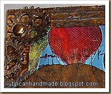
I thought that I would share with you an idea that I had for a unisex card.  I got to use one of my favourite paper-altering techniques (inspired by Tim Holtz of course) on it and my favourite hot-air balloon stamps.  I have never actually been up in a hot-air balloon, there is that pesky fear of falling out that I have to deal with – but I have always loved them.  So here it is – my attempt at a somewhat fun, colour-popping card that you could send to a male member of society, with the added bonus of a colour scheme that doesn’t rely heavily on dark muted tones.
 blogcards 031
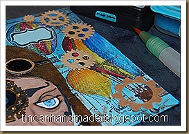
For the background I used a piece of light blue cardstock, pulled out a bunch of my favourite balloon stamps and used a masking technique to stamp the images.  (NB:  make sure that you masking glue really is masking glue because I didn't use masking glue and one of the masks got stuck to the top balloon and ripped some of the upper layer of paper there).
blogcards 021While the masks were still in position I stamped over the masks with the clockwork machinery stamps in Sepia Archival Ink and then over that I layered some text stamps from a Chiswick collection.  I then used  Distress ink in Salty Ocean, Tumbled Glass and Broken China to add more depth and contrast to the blue background.
blogcards 022 blogcards 016
I removed the masks and used Distress markers and Watercolour Pencils to colour in the balloons – This really made the background pop and contrast.
blogcards 031 blogcards 024 blogcards 029
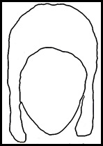
  Getting the pilot hat right was kinda silly –I took a couple of pictures of myself  in a long-eared beanie with my webcam to give me an idea of how  a 1940’s pilot hat would fit on a head.
Picture 39   Using that as my blueprint I did a rough sketch on Gimp to make it look more like a Biggles pilot hat and aviatorhatthen saved that outline to use as the cut-file on Make-the-cut (MTC from now on).  With MTC you have the option of pixel-tracing a JPEG and it converts into an SVG file ready for cutting on any plotter. I really like using these two programmes together.  If you do a search for Gimp brushes you can get a whole lotta images that you can use as digital stamps.  Once you import those into MTC – you can do some cool print and cuts with those saved files as well.
I used a Ranger product called Ink Refresher.  Tim Holtz demonstrated the potential of this product to create a leather look.  I originally used to use acrylic retarder to get paper supple and oily and leather looking, but I bought a bottle of this stuff to refresh my ink pads and decided to try the leather-look texturisation.  I was surprised – I had not expected it to work, feel and look any different to my acrylic retarder leather-look technique but I have to tell you – this product works so much, much,much better.  It makes the paper feel like soft suede and when you ink it for highlights and lowlights and crack burnishing it takes the ink really well without shredding the paper.  I love it.  To give the hat a little more worn and polished look I painted it with a clear acrylic varnish.
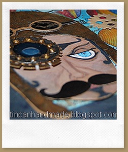
  I played around some more in MTC and drew some goggles and a couple of gears and a cool twirly moustache.
I drew in an eye, nose and mouth to the face and then added some steampunkery to the left side of the pilots face – I cut some of the gears and cogs on the card with regular dies (I think they were from X-cut – not sure now what brand they are because I store them unlabelled altogether)  and I cut the eye glass gears on MTC (you can make your own gears just by creative use of their inbuilt shapes and shape magic tools).  I stuck acetate to the back of the goggles and then poured in goopy White PVA glue and then coloured on top of that with a black permanent marker.
blogcards 025 blogcards 026blogcards 031 

I cut out a rectangular frame and embossed that with a couple of different blueprint, industry and cogs and gears folders – I painted over that with gold and black acrylic paint and then ran some brushed pewter distress paint over it to make it look tarnished and brassy.
blogcards 031
I die-cut “WILD RIDE” out of the the Alphablock strip die from Tim Holtz alterations and stuck the R-I-D-E on a narrow chocolate popsicle stick.  Excuse the undried glossy accents there.
Here are some freebie cut files in MTC Format if you want to try make this pilot too!  I had to split it into 2 mats - It only contains the SVGs for the eye gears, the face, the hat and the goggles( all in multiple layers so you can stack them for dimension).  You can fully customise the face by drawing it in yourself and the background etc is up to you. If you want these in another format – shoot me a comment and I will see what I can do.