Monday, July 28, 2014

Tim Holtz 12 Tags of 2014 - JULY

I know that I have been neglecting this blog a while. 

Sometimes life moves so slowly and then times like these I can barely catch my breath.  I still havent caught up on y'all's lovely comments from the last post, last month.  I need to get my groove on - I know.

I am going to plead super busyness and not and not do a step-by-step this month, of how I made this tag for the July edition of 12 tags, but I might just add some close ups of detail.  


Found out that I can emboss acetate with my thick stencils in my cuttlebug with the grey embossing mat! A + B + Rubber mat + acetate + stencil + B. This is actually a giraffe print pattern but I think on acetate it looks like water!

Loved making this bottle - I wanted it to look like there was an old treasure map in the bottle - Intense UTEE'ing took place here. I cut a triangle of cork lining for the bottle, I didnt use the die - just cut a triangle, it was faster and less hassle than pulling all my stuff out again.

The sand mix didn't turn out as nicely as I wanted but that is probably because I didnt want to use up all my glorious glossy accents on the sand mix so I tried to substitute white glue in.....Tim always knows better!


Monday, June 16, 2014

Pigs can fly


002Thought I’d share this really simple card that took only about 10 minutes to make.  It is a trifold or a “Z” card fold.  When you need to make a bunch of different card that are cool but dont take a lot of time, this is a handy go-to design.

You Need:

  • 2 o3 colours of Ink
  • 1 crazy stamp
  • Imagination for the sentiment
  • Calligraphy  or  chisel nibbed  Pen to write the sentiment
  • Contrasting Gel Pen if you want to add more flair to the Letterring
  • Fun button or embellishment

Picture1

Folding INSTRUCTIONS

  • fold A4 sheet into 3 equal sections A, B and C.
  • From the B section, start from about 2/3rd’s from the bottom of the card and start to draw a gentle curve all the way to the opposite edge of about 1/3rd from the bottom of section C
  • Cut away the top portion
  • Fold into a Z Shape

You can also glue down the open edge of the C- section to create a little pocket where you can insert a gift card or trinket.


Friday, June 13, 2014

Tim Holtz 12 Tags of 2014 – June Edition


007Would you believe it – I even managed to get my June tag ready before halfway through the month? 
Ever since I bought a series of Tim Holtz stencils, I have become very attached to them.  I was particularly excited to get started on this tag because it was  about cool stencil effects.  And since I now own a stack of these (Yes they finally arrived in my little dorpie in South Africa), I take every chance I get to bust them out and make up for the long lost time that I had to do without them. The technique this month was deliciously simple but a fabulous watercoloury stencil effect. 

In my last post – I showed you a background I did for the “Follow Your Heart” tag.  What I did was lightly mist the cardstock with water and only ink up the stencil, then I pressed the stencil down onto the wet cardstock.  I like this batik look and I do like the way the die pools up in certain places.
032
The technique Tim demonstrates for the stencil background of his June tag is very similar – except that he inks and mists the stencil and doesnt print on damp cardstock.  His method is so much more vibrant and gives a really lovely blended coverage.  See his tag here:
 DSC00313-3.38.05-PM 
One of the personal goals I set for  myself every month for this particular tag-share is to reinterpret the elements and theme such that it does preserve the technique and theme of the tag while challenging me to be more creative with my style.  I think its fun or like a really cool game to create something within certain boundaries but with the freedom to superimpose my brand of creative urging.
I am going to share a mini step-by-step of how I made this tag which I turned into a card topper.  I am going to try and show exactly what elements I kept and re-interpreted.

instructions0
005.text

014

instructions
instructions2
instructions3

Well there it is then – I kinda had fun doing the pic-torials with the arrows and the text as well.  Until later!


Wednesday, June 11, 2014

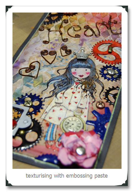
Compendium of Curiosities III–Challenge 4


052This is what I was inspired to create as my entry for Challenge 4 – aren’t you proud of me for getting it done before the deadline for the second time in a row?  Anyway – once more – the challenge required us to present our interpretation of the technique listed on Pge 49 of  Compendium of Curiosities Vol 3.  We are requested not to share the technique out of copyright respect to Tim Tim.
I have to admit that this was one of my favourite things that I have crafted this week purely because I used a slew of different Tim Techniques and because I love gears and doll stamps, wire, glossy accents and grunginess.  Personally, I thought it was awesome and I was pleased with the overall outcome. Chairman Mau however says:  “Busy, but pretty”…..

Here are a few close-ups for the seriously interested


Tuesday, June 10, 2014

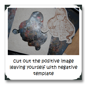
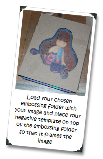
Selective Frame Embossing–Tips for getting the dents only in the places you want it


027.e026.eI am going to share my new favourite thing to do.  Right kids, hands up if you have become addicted to colourable doll stamps?  Now -other hand up if you suffer from anxiety when you want both the stamp and the embossing pattern to exist on the same piece of paper?  Now raise your right foot if you want the embossed pattern to hug the image and not emboss the image as well.  I am raising all my appendages right now – like an impatient kid in a classroom who’s bursting to win teacher’s approval.

I cant take too much credit for this idea.  I sorta adapted the idea from those selective embossing frames that Ranger sells.  Squares, rectangles and arches are nice and all but I wanted customised frame embossing for my stamps.  I like the texturised backgrounds but I also want the texture not to interfere with the focal point of my card.  So here is the solution that I came up with.

THINGS YOU NEED

  • Book Cover Board or any heavyweight chipboard
  • Awesome Stamp
  • Craft knife or if you have a cutter that will do a print and cut and can cut chipboard – that will make your arthritis miraculously disappear
  • Patience
  • Embossing Folder and Embossing Machine

METHOD of MADNESS

    Use your piece as your awesomely cool card or tag topper!
    I’d love to see what you come up with – if you would like to share it – post a link to your creation in the comments section.


Thursday, May 29, 2014

Tim Holtz 12 tags of 2014 May


With 1st Semester exams underway for my students, my time has finally freed up a little for me to devote some much craved for time to make my “tag” entry for the May 2014 edition of the Tim Holtz challenge. Over there on the left was what the talented Tim challenged us with.The focus was on using all those ideology trinkets that we all love to collect and framing them on little paper tiles.  He also showcased the new shadow embossing folders there on the bottom right.  Those haven’t arrived in my part of the global woods yet so I had to change it up a little.

002
For this month’s “tag” – I decided that I wanted to make something more functional than a tag. Father’s day is coming up and that requires an awesome card for Dad.  I put tons of work into this piece inspired by the TH May because I have a brilliant dad who deserves every bit of detail and attention and coolness.

DSC01804
I also got inspired for the design of this tag by how much I loved the effect of the pipes in my previous post (Click the grey text to go there -the rosey pipe-line for Linda Ledbetter's CC3 Challenge).  I decided to mess around some more with pipe configurations and I really love how this card turned out.  I think my dad is going to like it too.

dazzle_stencil_4f538b4f97610__42366embossing folder pics
For the background of the card I used the diamond plate from the diamond plate and riveted metal texture fade set by sizzix and the Brick wall stencil from Enmarc. 

Making the glazed brick texture was one of those salted UTEE experiments.  I inked through the Brick Wall stencil with Archival Ink first in Monarch Orange and then lightly in Plum and then with my salted UTEE heat embossed. 

DSC01800DSC01803

The effect it created was a lovely, rough and sandy looking glazing.  I have to remember this trick for later. Over that I layered the riveted metal piece that I painted with distress paint.  I wanted to create the effect of an industrial basement in a building with some exposed face-brick wall and valves and gauges and pipes.


001.e


To make the pipes – I did the old drinking straw trick again – you can find out how I did that in the post that precedes this by clicking here: http://tincanhandmade.blogspot.com/2014/05/everything-is-coming-up-roses.html


008


I used a variety of Ideology tinkets and the Gears Die to embellish the tiles.  The tiles are cut from a variety of Tim Holtz papers and I stamped on some of them with some industrial blueprint looking stamps from the Tim Holtz Stampers Anonymous Collection.

007

So I think I kept the theme of the May challenge – don’t you?  I’m entering it as my version.  It is all about what those tag challenges inspire right?  Hope Mr Tim doesn’t mind that I didn’t make a tag.  More importantly – I love that this is going to be dad’s father’s day card – getting all those straws etc. to glue and stay glued at the proper angles was a proper mission, I fiddles with the details for hours.  Dad is the only guy who can be trusted to treasure and appreciate all the work and of course all those lovely ideology trinkets!


Everything is coming up roses


005I have had really good intentions to enter Linda Ledbetter’s Compendium of Curiosities 3 challenge.  I just never managed to find the time to sit down and make something.  However – when I saw Challenge 3 – I knew that I had to do this one atleast.  If you dont know about the challenge, here’s a little link to the rules of  engagement http://lindaledbetter.com/compendium-of-curiosities-3-challenge-faq 

The current challenge is to use the faux tea-rose technique on page 65 of Volume 3 of Tim Holtz’ Compendium of Curiosities.  I had loads of those left over when I did the April Tag for the Tim Holtz 12 Tags of 2014 challenge and I have been dying to try out an idea I have had in my head for a while. 

I saw these metallic drinking straws on Amazon and in my head, I saw metal pipes. I wanted to make an industrial type looking thing with pipes and gears and taps (faucets)  When I saw what the CC3 challenge was about this time – I immediately had a vision of a rose pipe-line.  And the idea gave birth to this piece above.  I love how it turned out – I really want to explore the pipe-potential in different configurations now.

To make the pipes – I just took ordinary drinking straws and painted them with distress paint and then I cut them to the sizes that I wanted. The faux tea-roses ofcourse are cut with the die mentioned in the book.  A cool thing I have been doing recently is cutting off the last few petals on the spiral – that gives me control over the size of the roses.  

The background is just a piece of cereal box board that I painted with gesso and then distress paint and the goldleafed a little.  I accidentally discovered a DIY way to make goldleafing – will write a post on that sometime soon.  I drew the black- lines in real hard to create the effect indentation with the aim of making it look like shingled planks.  I know this challenge is really about the faux tea-roses but all I am obsessing about right now are those cool pipes – the industrial/grunge/steampunk loving crafters will understand that.  I am going to have to make many more pipe-lines in the future just to get it out of my system. I think I am going to pipe-out my tag entry for  the 2014 12 Tags May Tim Holtz challenge as well.

Wednesday, May 21, 2014

BOXING WITH TINCAN (*sorry about the weird layout - cant figure the fix)


001001My dearest Chairman Mau has a shop in the Drakensberg (KZN, South Africa) called Living Art Gems at Thokozisa Centre near Champagne Castle and Cathkin Peak and if you love interesting places filled to the brim with handmade crafts and crystals and gems and if you find yourself in this area– this is the place to go. (Shop 6 – Thokozisa)

004The Chairman knows a  win-win situation – he gives me a set of these blank boxes and says that I can decorate them whichever way I felt like to sell in the shop.  

Oh what manner of joy is this?

010I am kept entertained, blissful and thrilled at the chance to colour like a 4 year old who has just discovered paint and by distracting me like that – he wins double, as by default I am  less prone to be bratty and maybe that serves the purpose of me being a little more manageable for him. 
Chairman also scores by getting some more craftsy things to add to his shop inventory.

I used a bunch of different colouring tools on these boxes .

026I primarily used Ranger Alcohol Ink to colourwash the boxes. Tim Holtz gave me the great idea of putting drops of alcohol into a palette and letting that dry then using a blender pen with blending solution or in my case a water brush filled with blending solution to pick up some of dried colour to stain the bland boxes.  You get really bang for buck that way – you really would be surprised at how far that one drop goes when stretched out with alcohol.

012I also coloured on them a bit with alcohol based Permanent Markers and I used Sharpies and Bic Markers – oh horror go the elite crafters with their Copics and Spectrum Noir sets. 

To be truthful, there are a lot of things I do with ordinary common kids craft supplies that are not the exclusive craft inventory that are sold as essential elite craft supplies. Like the other day I saw a kit of regular run of the mill glitter branded with the label of that lady with those TV Shows in one where she makes things and the other where she fires people and it was priced at nothing short of extortion! I was like no wonder the lady did some time in the Big House!!!! I can get the more of the same thing in the kids craft section for a 100th of the cost.


016I did crumble and order me a set of a set of 36 Derwent Inktense Pencils – oh my – can a pencil get any awesomer??? I have been wanting them for ages.  They are highly pigmented and move like watercolours when “wetted” and they dry permanent.  Not only that but you can also draw on canvas or fabric with them.  I think they rock. I colour-painted on the boxes with these sweet babies too.

006I stamped on the boxes at first with Stazon, but my black Stazon ink pad is so dried out and non-usable that I gave that up after a few not so fresh impressions.  Bring out Ranger to save the day – the Archival Ink worked like a freaking dream.  Ranger is the one brand that I dont ever have buyer’s remorse or frugal-attack over.
021008 

I am not paid by Ranger nor do I get any stuff from Ranger – so this review is purely based on my experience of their consistent quality, versatility and ease of use within their product-line.  Their inks and dyes and things last forever.  I have Distress Ink pads that sat with their lid off them for about a month that are still juicy and vibrant. 
023

Archival Ink, is not as sticky as Stazon but you can pretty much stamp onto anything with it, and if you heat-set it – you get a semi-permanent impression.  I never ever wash my boxes or cards or tags – so I dont need them to be as permanent as the pyramids. Ranger Archival Ink is my go-to ink if I want an impression that is hardy.  So while I did go on a rant about that lady’s glitter pack earlier, I dont mind spending money on the Ranger line, and I do make exceptions about buying more exclusive supplies when they perform above and beyond the call of duty.
005

I am not sure the Chairman knew that when he gave me those boxes to mess around with, that it would be a true game changer and that life as we know it would irreversibly shift.  I have decided that all I want to do in life, well at least for the next few weeks is paint and stamp on boxes.