Thursday, October 16, 2014

12 Tags of 2014 – October


DSC_0115Well it’s October and time for another Tim tag….and it is truly scary because here in good ol’South Africa - Halloween is a non-event. 
Our kids dont trick or treat, I wear crazy outfits everyday and the only horrifying thing about the 31st of October every year is that we realize that Christmas is around the bend and we should have started saving earlier for that huge Christmas splurge. 
So to keep myself locally relevant – my big trick for this month is that I am going to pass on the all the Boo, pumpkins and Ghoulery , but treat you to my reinterpretation inspired by the October Tim Tag…..see what I am doing there huh with the trick and treat and all of that? I have kept the key design elements and techniques and adapted them to fit my needs.


Here below is my method of madness.
– the /ink/paint spatter. 

DSC_0120
We dont have the distress spray stains in South Africa yet so I had to come up with a new plan – I soaked a regular paint brush in Distress Ink Refill Ink and used the Distress Spray Tool to “spray splotch” the ink onto the background.

- the texture paste & stamped, masked elements.
DSC_0119
DSC_0112


I used the eye from the Stamper’s Anonymous Oddities Collection,a pastel gel pen to colour in the iris and the Victorian Velvet Pen to colour in skin.  You can’t really see it all that well in this picture but I used a dark purple metallic gel pen to give the eye some eyeliner too.  the  and the Eyechart stencil.  I felt like the stencilled paste needed a little more contrast against the hectic splotch background there so I rubbed some metallic tarnished brass Distress Stain on it, then I sprinkled some embossing powder on that and heat set.  Finally I took a black pen and outlined the embossed bits to create the illusion of a shadow.

- the pumpkin bit
DSC_0115I played around with the stamped eye image again and cut it out etc – but it looked well psycho, like a carved out eye on a ransom note or something. I hated that – yeah I am my own hater!  In the meantime I was experimenting with the bottle dies again.  I wanted to create a vintagey handblown glass looking bottle for some other project and I was spreading on Clear PVC Cement on a bottle acetate die-cut and loving the effect.  It suddenly dawned on me that I could frame the eye in the vintage bottle.  To create the blue glass effect – I squirted some alcohol ink on the craft sheet and using the waterbrush, I coloured the reverse side of the bottle die-cut.  I dripped some plain old alcohol into the coloured bits to give it more of a uneven effect like the way light catches old glass. I glossy accented on top of the dried PVC Cement bits.
- the boo part
 12 tags of 2014 - october... | www.timholtz.com
DSC_0115
DSC_0115
DSC_0115


Those Alpha-tiles were not available yet here as well.  So my fix was to cut scrabble like tiles from board and stamp my sentiment.  I didn’t have a tiny numbers stamp-font so I wrote in the letter values for the scrabble tiles.


- the tinsel ,trinkets and the trim
12 tags of 2014 - october... | www.timholtz.comDSC_011212 tags of 2014 - october... | www.timholtz.com

I liked the look of the stripy tag hang on the original tag so I substituted the baker’s twine in for the tinsel bit.  See those trinkets there on Tim’s tags?  I thought it would be in-theme to substitute that with a rolled up eye-chart.  I had bought those tiny acrylic versions that Stamper’s Anonymous once put out and it had a tiny version of the eyechart stamp in one of those collections.  I did do Monocle thingie with the eye rub-on, and attached it to the top an all but it looked lame and too busy at that point, so I detached it and left the tag as it is.


Thursday, September 11, 2014

Sneak-Peak: I’m a GUEST DESIGNER for “Our Creative Corner” this month!!!


I have been so excited about this for so long and I am even more than excited to finally be able to direct you over to Our Creative Corner“ where I have had the excellent honour of being invited to be the guest designer this month.


creatification

\krē-ˈā-tə-fə-ˈkā-shən\

Verbal Noun

-Contraction of Creative  and Gratification

-The process of being completely gratified through licentious creativity

-Excessive indulgence in creative enterprises eliciting a state of extreme bliss and satisfaction


I have got to say that I had the most amount of creatification I have ever had with this project!!!  For you to get some of your own “creatification” on, pop on over to Our Creative Corner by clicking here – and you will find instructions for all my personal techniques for creating the special effects and elements I used on this project. 

I am not going to tell you exactly what the project is – ‘cos that will just spoil the surprise now, wouldn’t it? 

Here are a few more teasers though….

DSC_0147DSC_0137SAMSUNG CAMERA PICTURES

Check it out over at Our Creative Corner and tell me whether you guessed at what it is …..and whether you liked it:


Sunday, September 7, 2014

Tim Holtz 12 Tags of 2014 - September


DSC_0171Well it was a creative weekend – not only did I get the August tag done but I also managed to do the September tag all in one go. 

Tim Holtz challenged us to bust out those alcohol inks and do some ghost stencilling, die-cutting and stamping (cos it it is STAMPTEMBER). 

Y’all know how I like clutter and mess though on my tags – so to try and keep my tag simple and unclutterd was a little bit of task for me.  Eventually I compromised – and allowed myself to ghost stencil a coloured background.  But I did colour everything – because life is colourful.

What I was hoping to convey in this tag was the idea that in life you can have all the things you want, all the the dreams you want to live, all the time you want, love you want, peace you want if you bring your own fulfilment into being.

From the Tim Tag – instead of the “Frenzy of Butterflies” I used the “Tattered Florals” Strip Die. I wanted it to look like a hand releasing a shower of flowers, the idea ofcourse being that you bring your own flowers to your life.


When I did the tag background, I was sad to have to embellish it because I thought it was great by itself. I created the background by multi-layering the ghosting technique – as per usual – I couldnt just stick to one colour.

I loved making the background for the flowers.  Tim is right – glossy cardstock and alcohol based inks are the bomb!! I sloshed alcohol based ink in many, many different colours all over a strip of the glossy stuff. I smooshed it all together and then when that dried I layered more ink over that and let it run all over. Check out this awesomely cool effect it had going over here.

I used the tattered florals strip die to cut out some florals – arranged them so that they look like a hand releasing a cascading shower of blooms and then I glossy accented the hek out of those. To add a bit of dimension – I glued on flat-back pearls on the flowers. 


Saturday, September 6, 2014

RETRO Tim Holtz 12 Tags of 2014– August


                                                                                             DSC_0167
Disclaimer:  I didn't make it in time for Tim Holtz in August because I was busy with another exciting project that I will tell you about on the 11th of this month!

I did promise myself this that I would commit to make a tag for every month of 2014 – so I decided to go ahead and make one retroactively.

If I am submitting to the Holtz Collection, I try to stay within the Tim Holtz / Ranger line of products,stamps, trinkets and dies.  That challenges me to be original in the interpretation and arrangement of something familiar and well-known to his global fan-base.  I gotta tell ya though, while it’s lovely to rework the theme with my existing stash of Holtz’ings, the pressure gets cranked up. I always kinda think – it’s like taking a famous symphony and then putting your own touch on it, this is an extremely high-risk enterprise!!!  The devotees hold you to high standard so to deliver a half-holtzed attempt is something akin to sacrilege right? 

So since I didn't make the TH Blog deadline, I decided that I was just going to go a little nuts and use the layout and the technique somewhat but I would branch out of the Holtz collection and give myself the creative freedom to go where my eye and heart was leading.  On the right is the result boldly titled “Dreamer of dreams”.

Recently, I have been wondering about consciousness, forms of  knowing, seeing with different forms of vision.  I have become very taken with the quest to see how much more of the experience of consciousness we can experience.

I am so grateful to a few people in my life but particularly to my first husband  - “Bear, the Fire-starter” as well as my “Chairman Mau” who have both steered me in directions that got me to this point where I feel like I am slowly being delivered into a realm of consciousness that I didn’t know I could exist within.  

I am grateful that I finally have awakening to the idea that to be conscious is to love, to feel connected, and to embrace the dreams that exist inside my inner world that I have always been ashamed to acknowledge existing inside there.

I am thankful that I have the opportunity to express my inner vision through this medium of collage or mixed media art.  I have always loved the Holtz style because it resonates with how my mind projects my thoughts, feelings, experiences, memories on its internal canvas. There is something intimately familiar in his style that reminds me of how my mind sees, interprets and organises the world.  My dreams are vivid, in colour and a little all jumbled together in a wondrous, whimsical medley of sights and sounds superimposing themselves on existing memories and feelings.  I love that I can express the incredibleness of it somewhat through the medium of art.

Monday, July 28, 2014

Tim Holtz 12 Tags of 2014 - JULY

I know that I have been neglecting this blog a while. 

Sometimes life moves so slowly and then times like these I can barely catch my breath.  I still havent caught up on y'all's lovely comments from the last post, last month.  I need to get my groove on - I know.

I am going to plead super busyness and not and not do a step-by-step this month, of how I made this tag for the July edition of 12 tags, but I might just add some close ups of detail.  


Found out that I can emboss acetate with my thick stencils in my cuttlebug with the grey embossing mat! A + B + Rubber mat + acetate + stencil + B. This is actually a giraffe print pattern but I think on acetate it looks like water!

Loved making this bottle - I wanted it to look like there was an old treasure map in the bottle - Intense UTEE'ing took place here. I cut a triangle of cork lining for the bottle, I didnt use the die - just cut a triangle, it was faster and less hassle than pulling all my stuff out again.

The sand mix didn't turn out as nicely as I wanted but that is probably because I didnt want to use up all my glorious glossy accents on the sand mix so I tried to substitute white glue in.....Tim always knows better!


Monday, June 16, 2014

Pigs can fly


002Thought I’d share this really simple card that took only about 10 minutes to make.  It is a trifold or a “Z” card fold.  When you need to make a bunch of different card that are cool but dont take a lot of time, this is a handy go-to design.

You Need:

  • 2 o3 colours of Ink
  • 1 crazy stamp
  • Imagination for the sentiment
  • Calligraphy  or  chisel nibbed  Pen to write the sentiment
  • Contrasting Gel Pen if you want to add more flair to the Letterring
  • Fun button or embellishment

Picture1

Folding INSTRUCTIONS

  • fold A4 sheet into 3 equal sections A, B and C.
  • From the B section, start from about 2/3rd’s from the bottom of the card and start to draw a gentle curve all the way to the opposite edge of about 1/3rd from the bottom of section C
  • Cut away the top portion
  • Fold into a Z Shape

You can also glue down the open edge of the C- section to create a little pocket where you can insert a gift card or trinket.


Friday, June 13, 2014

Tim Holtz 12 Tags of 2014 – June Edition


007Would you believe it – I even managed to get my June tag ready before halfway through the month? 
Ever since I bought a series of Tim Holtz stencils, I have become very attached to them.  I was particularly excited to get started on this tag because it was  about cool stencil effects.  And since I now own a stack of these (Yes they finally arrived in my little dorpie in South Africa), I take every chance I get to bust them out and make up for the long lost time that I had to do without them. The technique this month was deliciously simple but a fabulous watercoloury stencil effect. 

In my last post – I showed you a background I did for the “Follow Your Heart” tag.  What I did was lightly mist the cardstock with water and only ink up the stencil, then I pressed the stencil down onto the wet cardstock.  I like this batik look and I do like the way the die pools up in certain places.
032
The technique Tim demonstrates for the stencil background of his June tag is very similar – except that he inks and mists the stencil and doesnt print on damp cardstock.  His method is so much more vibrant and gives a really lovely blended coverage.  See his tag here:
 DSC00313-3.38.05-PM 
One of the personal goals I set for  myself every month for this particular tag-share is to reinterpret the elements and theme such that it does preserve the technique and theme of the tag while challenging me to be more creative with my style.  I think its fun or like a really cool game to create something within certain boundaries but with the freedom to superimpose my brand of creative urging.
I am going to share a mini step-by-step of how I made this tag which I turned into a card topper.  I am going to try and show exactly what elements I kept and re-interpreted.

instructions0
005.text

014

instructions
instructions2
instructions3

Well there it is then – I kinda had fun doing the pic-torials with the arrows and the text as well.  Until later!


Wednesday, June 11, 2014

Compendium of Curiosities III–Challenge 4


052This is what I was inspired to create as my entry for Challenge 4 – aren’t you proud of me for getting it done before the deadline for the second time in a row?  Anyway – once more – the challenge required us to present our interpretation of the technique listed on Pge 49 of  Compendium of Curiosities Vol 3.  We are requested not to share the technique out of copyright respect to Tim Tim.
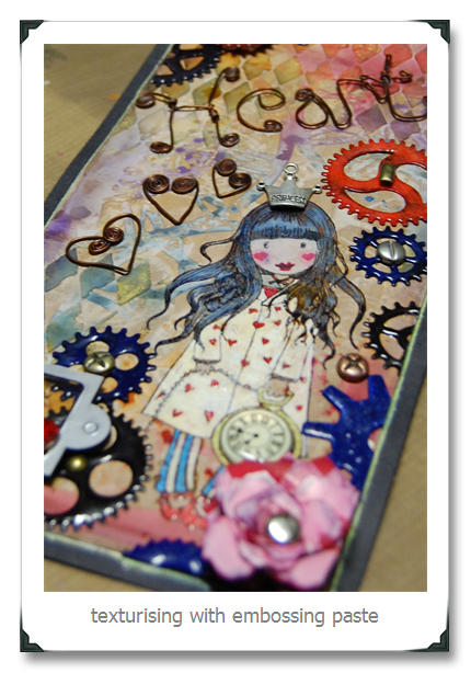
I have to admit that this was one of my favourite things that I have crafted this week purely because I used a slew of different Tim Techniques and because I love gears and doll stamps, wire, glossy accents and grunginess.  Personally, I thought it was awesome and I was pleased with the overall outcome. Chairman Mau however says:  “Busy, but pretty”…..

Here are a few close-ups for the seriously interested


Tuesday, June 10, 2014

Selective Frame Embossing–Tips for getting the dents only in the places you want it


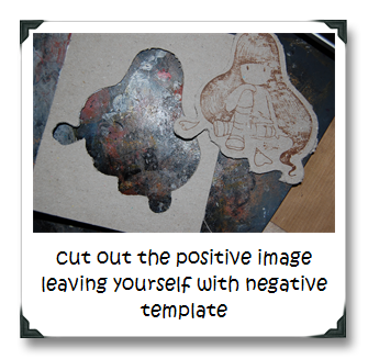
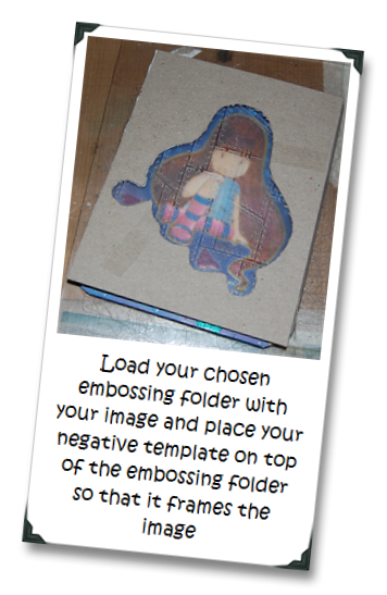
027.e026.eI am going to share my new favourite thing to do.  Right kids, hands up if you have become addicted to colourable doll stamps?  Now -other hand up if you suffer from anxiety when you want both the stamp and the embossing pattern to exist on the same piece of paper?  Now raise your right foot if you want the embossed pattern to hug the image and not emboss the image as well.  I am raising all my appendages right now – like an impatient kid in a classroom who’s bursting to win teacher’s approval.

I cant take too much credit for this idea.  I sorta adapted the idea from those selective embossing frames that Ranger sells.  Squares, rectangles and arches are nice and all but I wanted customised frame embossing for my stamps.  I like the texturised backgrounds but I also want the texture not to interfere with the focal point of my card.  So here is the solution that I came up with.

THINGS YOU NEED

  • Book Cover Board or any heavyweight chipboard
  • Awesome Stamp
  • Craft knife or if you have a cutter that will do a print and cut and can cut chipboard – that will make your arthritis miraculously disappear
  • Patience
  • Embossing Folder and Embossing Machine

METHOD of MADNESS

    Use your piece as your awesomely cool card or tag topper!
    I’d love to see what you come up with – if you would like to share it – post a link to your creation in the comments section.