I always have a hard time trying to make cards and gifts for guys. Even when you do a search for inspiration on male-themed cards your returns are standard fare – military, sailing, cars or tools right? Does a masculine card really have to be limited to neutral or muted colour palettes? Are they really loving those golf-themed and fly-fishing efforts? I think we need more guys in our cardmaking circles to give us some kind of direction in the way of new themes for guys. Luckily for us we have steampunk and grunge to shake up the mix a little – there are after all , only so many times that you can re-interpret a golf-ball image.
I thought that I would share with you an idea that I had for a unisex card. I got to use one of my favourite paper-altering techniques (inspired by Tim Holtz of course) on it and my favourite hot-air balloon stamps. I have never actually been up in a hot-air balloon, there is that pesky fear of falling out that I have to deal with – but I have always loved them. So here it is – my attempt at a somewhat fun, colour-popping card that you could send to a male member of society, with the added bonus of a colour scheme that doesn’t rely heavily on dark muted tones.

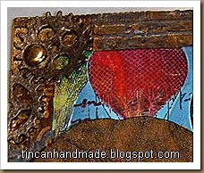
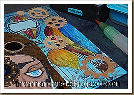
For the background I used a piece of light blue cardstock, pulled out a bunch of my favourite balloon stamps and used a masking technique to stamp the images. (NB: make sure that you masking glue really is masking glue because I didn't use masking glue and one of the masks got stuck to the top balloon and ripped some of the upper layer of paper there).
 While the masks were still in position I stamped over the masks with the clockwork machinery stamps in Sepia Archival Ink and then over that I layered some text stamps from a Chiswick collection. I then used Distress ink in Salty Ocean, Tumbled Glass and Broken China to add more depth and contrast to the blue background.
I removed the masks and used Distress markers and Watercolour Pencils to colour in the balloons – This really made the background pop and contrast.
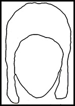
Getting the pilot hat right was kinda silly –I took a couple of pictures of myself in a long-eared beanie with my webcam to give me an idea of how a 1940’s pilot hat would fit on a head.
 Using that as my blueprint I did a rough sketch on Gimp to make it look more like a Biggles pilot hat and
  then saved that outline to use as the cut-file on Make-the-cut (MTC from now on). With MTC you have the option of pixel-tracing a JPEG and it converts into an SVG file ready for cutting on any plotter. I really like using these two programmes together. If you do a search for Gimp brushes you can get a whole lotta images that you can use as digital stamps. Once you import those into MTC – you can do some cool print and cuts with those saved files as well.
I used a Ranger product called Ink Refresher. Tim Holtz demonstrated the potential of this product to create a leather look. I originally used to use acrylic retarder to get paper supple and oily and leather looking, but I bought a bottle of this stuff to refresh my ink pads and decided to try the leather-look texturisation. I was surprised – I had not expected it to work, feel and look any different to my acrylic retarder leather-look technique but I have to tell you – this product works so much, much,much better. It makes the paper feel like soft suede and when you ink it for highlights and lowlights and crack burnishing it takes the ink really well without shredding the paper. I love it. To give the hat a little more worn and polished look I painted it with a clear acrylic varnish.
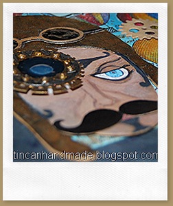
I played around some more in MTC and drew some goggles and a couple of gears and a cool twirly moustache.
I drew in an eye, nose and mouth to the face and then added some steampunkery to the left side of the pilots face – I cut some of the gears and cogs on the card with regular dies (I think they were from X-cut – not sure now what brand they are because I store them unlabelled altogether) and I cut the eye glass gears on MTC (you can make your own gears just by creative use of their inbuilt shapes and shape magic tools). I stuck acetate to the back of the goggles and then poured in goopy White PVA glue and then coloured on top of that with a black permanent marker.
I cut out a rectangular frame and embossed that with a couple of different blueprint, industry and cogs and gears folders – I painted over that with gold and black acrylic paint and then ran some brushed pewter distress paint over it to make it look tarnished and brassy.
I die-cut “WILD RIDE” out of the the Alphablock strip die from Tim Holtz alterations and stuck the R-I-D-E on a narrow chocolate popsicle stick. Excuse the undried glossy accents there.
Here are some freebie cut files in MTC Format if you want to try make this pilot too! I had to split it into 2 mats - It only contains the SVGs for the eye gears, the face, the hat and the goggles( all in multiple layers so you can stack them for dimension). You can fully customise the face by drawing it in yourself and the background etc is up to you. If you want these in another format – shoot me a comment and I will see what I can do.


Such a fabulous and clever design, I just love the masking, the layers and beautiful bright colours. You did a grand job and what a great way to get the right fit for the pilot's hat. Brilliant.
ReplyDeletehugs {brenda} x0x
Your steampunk style card is awesome! I love the look you achieved using the masking technique and stamping all of the clockwork pieces over the hot air balloons. These are great stamps for working with the steampunk style! Your vintage pilot looks very cool, too. Amazing what you can do on a computer! I'm not so techno savvy. haha But, I really like what you created. The colors are all really nice and the embossed frame really is a wonderful accent for your card. I am glad that you liked my transformed craft organizer and that it has inspired you to transform your bedroom. With your talent, I bet you could create a really cool, fun and creative steampunk look. I think it would be awesome! But, I love steampunk! :) Good luck with your project!! <3 Candy
ReplyDeleteawesome card, thanks for telling us all that went into it!
ReplyDeleteWhat a wild make - it's fantastic! So much fun and energy and life. Brilliant grungy metal look and fab texture - love it!
ReplyDeleteAlison x
Fabulous detailed and colourful make! Love your May tag also. I've just been over to your other blog and you are doing something amazing those students look as though the 're having a ball! Fantastic work! Thanks for sharing the silicone mould tutorial i shall definitely be giving this a try. I love finding cheaper substitutes to expensive craft products. Keep up the good work x
ReplyDeleteWOW! Your art is amazing!
ReplyDeleteI am glad you left me a comment so that
I found you and your blog.
I am going to follow you!
Thanks for the love on my May tag!
I love your process and dedication to creating a great unisex card....I agree the emergence of steampunk has helped a lot in that regard. Thanks for stopping by the Fun Room with your kind comments!
ReplyDeleteThank you for visiting my blog a few weeks back. I'm glad you did because it gave me a chance to browse yours, which I've thoroughly enjoyed. I used to do a lot of rubberstamping so it was fascinating for me to go through and see all of your wonderful works of art.
ReplyDeleteI enjoyed your comment on my blog and was wondering if you could update me on your results. I'm just curious. =)
*Kat*
Your card is awesome!!!!
ReplyDeleteYou lost me on the technical jargon though, teehee.
Thanks Tracy - I plan to spend today doing something crafty - haven't done anything interesting in a while!
DeleteQuite fabulous and very original also love the photo of you and the funky hat, very cool!
ReplyDelete:) Chris / CS Designs ... Doodle Pieces