I have a confession – I am a little bit envious of everyone in the US. Why? Because “y’all” can get cool Tim Holtz stuff for next to nothing while I have to save for ages and ages to get one product – the rand-dollar exchange is nothing short of dismal and with our shady national postal service – things go missing regularly. So in order to get anything Holtzy, I either have to order online from abroad and pay a weeks worth of salary (conversion-specific), and because you have to insure, send via traceable USPS Priority Mail (and their rates are soul crushing) – or I wait until the product is stocked in South Africa often months after the initial release – and then there’s their mark-up on top of all of that. Not only that – but these products usually arrive at weird times of the month when your wallet is not feeling too fresh and they appear on the stockist site for a millisecond before the stockist sells out. Thus, it is the sad state of affairs that I can usually afford one product a quarter.
This year I decided – enough drooling – I have to take charge of my desires – I have to own my lustful wants and I am charging forward with a game plan to set it in motion. What I came up with was that I would try to win some Tim Holtz – I figure entering a competition is worth the challenge…..well that and the possibility of scoring some funderful Holtzy goodness if they would randomly draw my ticket in the Tag Challenge.
All was good and well until I realised that barring an impressive collection of distress ink, stain, and markers – I didn’t actually have a whole lot else of Hotzness. I have a couple of Movers and Shapers dies, a few embossing folders and couple of shades of distress paint and a bunch of Ranger Mediums. The order that I put in for a couple of sets of Visual Artistry Stamp sets last year – got lost somewhere via route to me in my quiet little east-coastal village here in South Africa. And even though I licked my hurting wallet wounds and swore never to put it through such agony again, I gave it one more shot like a trooper and tried to get some off E-Bay a while back – we’ll see how that turns out., still patiently-on-the-verge-of-blind-panic-waiting for any kind of notification that it has got here, even into the country would be a step in a calming direction.
All these little inconveniences presented to me a problem that I didn't consider - getting in on the 12 Tags of 2013 challenge, would sort of require you to use all the stuff that he was going with – and I didn't necessarily have all the cool stuff – yet (for the next couple of years yet) so this was going to be challenging indeed. I really wanted to do it though and so I made it a quest to create a personal creative interpretation of the tag posted in this month’s challenge.
What I eventually came up with was truly a test of creative work-around. I interpreted the challenge in a way that would be somewhat original, but embrace the basics of the Tim Holtz “sketch” or blueprint. I didn't have the bunny die, or the foliage elements and I threw out all my tinsel last year after Christmas so here is what I did. My concept was something whimsical, that included my love of the genre of steam punk and that would work with what I have on hand. In the process I discovered a handy trick, later on in this post I will unpack that a bit about that.

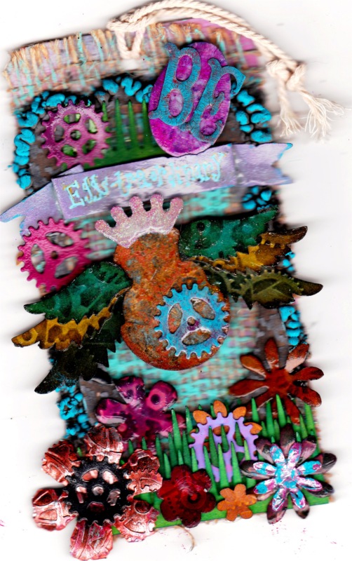
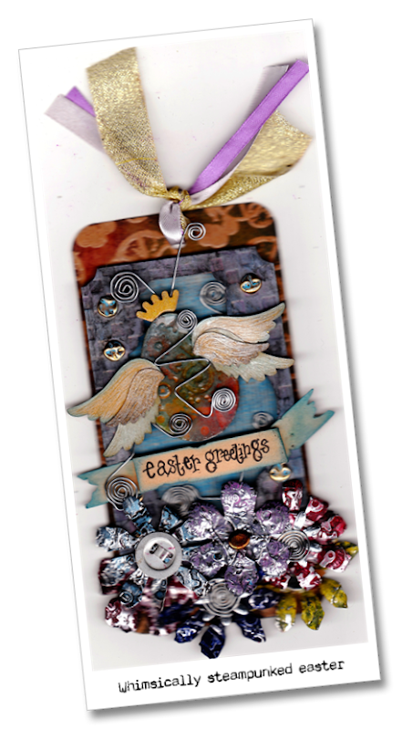
I drew the egg-shape in GIMP, traced that image into .SVG on Make The Cut and cut it out of grunge-paper on my cutter. I distress inked the egg shape and then ran it through the cuttlebug with the sizzix gears folder

. I then ran some Metallic distress stain over the top to pop out the gears. I then applied a layer of Glossy Accents to make it glossy – who can resist a little gloss right? I cut the tattered florals out of aluminium tape that I taped onto lightweight cardstock with the Movers and Shapers mini tattered florals die from Sizzix Alterations.

Using the gears folder again, I ran it through the cuttlebug and then I used distress paint (loving this stuff) in Fired Brick, Salty Ocean, Chipped Sapphire, Mustard seed and a blend of Dusty Concord and Picked Raspberry. I made my own version of Kraft Resist Cardstock to cover the background of the tag by stamping and embossing on kraft cardstock and then inked it with Fired Brick, Crushed Olive and Chipped Sapphire. I cut the tattered banner out of grunge-paper as well and inked it with Old Paper (I think) and Tumbled Glass – I then wrote on an Easter sentiment with a laundry marker – I love laundry markers. The little wire swirls were a just ordinary wire that I swirled and shaped into the elements that I wanted.
Now comes the crazy discovery that I made – You see the wings, the frame and the little crown – well I discovered a neat trick when trying to get the right proportions for my tag. I discovered that if you have those physical dies in whatever size they are, you can resize them to some degree. Here is how you do that.
- Using your regular die-cutting system like the Big Shot / Vagabond / Cuttlebug etc – go ahead and cut the shape out of black paper.
- Place the shape into your scanner with a white background. My Scanner has a white background anyway, but for good measure I placed a piece of white printer paper on it.
- Scan and save the shape.
- Open the scanned image in an image editing programme like Gimp / Photoshop even MS Paint will do the job
- Crop as close to the image as you can and then convert the image to black and white. Adjust the sharpness etc if you want. You now have quite a bold digital silhouette of your shape.
- Open MAKE THE CUT and pixel trace the silhouette. Add that shape to your Mat.
- You now get a passable copy of the die-cut that you can resize to whatever size you need (it is not going to be as crisp and tight and neat as the original die-cut – but it is a fair enough copy.
- I wondered whether this was ethically correct to post this trick that I discovered – but I rationalised it by going – I bought and own the original Sizzix die and all this is doing is like either cutting it down to make it smaller (which I could have done painstakingly with “fairy-sized” scissors or blowing up the shape on a copier and then painstakingly cutting around it.) The ability to manipulate, trace and cut shapes with MAKE THE CUT just make it heaps less painful.
Anyway I did that with the Mini-tickets and Mini-labels dies to make the frame – I placed the mini-label in the resized Mini Ticket die. Don't do this with Sizzix images taken off the net though because I think that would infringe the patent or whatever they call that.
The background behind the egg is a piece of an old venetian blind. I always look out for people throwing stuff away because you find the coolest texture thingies like that. This stuff is made of a type of material that is almost like paper and almost like cloth – I have no idea what it is – the thrill in this discovery though is that it inks up pretty awesomely. It takes Distress ink really well, but in this case I used Salty Ocean Distress Paint.
For the second tag, the concept was more storybook-fantastical but steampunky of course. The elements that I kept from Tim’s original tag were the cut out window that exposes the background texture, the sentiment banner, and the fringe-bottom. I also endeavoured to keep the look of the lacquered enamel on the “tattered floral” in lieu of the foliage elements. I designed and cut the grassy fringe in MAKE THE CUT by tracing a royalty free clip-art graphic of a hair comb – I did the old resizing trick with the tattered florals and wings– as you will notice – the smaller you resize, the less detail you get. I steampunked the wings and the florals through the cuttlebug. The little gears were from an X-Cut die-set I think. I loved the rusty egg effect I was able to get on the egg – it involved painting multiple layers on the egg, sanding bits of it off and then applying some Metallic Distress Stain. I used crackle accents on the little egg and the “BE”. I used a lot of Distress Paint on this tag. The other product that I used on it is Dala Puff Paint, which I then highlighted with Salty Ocean Distress Paint. Anyway, these are the two tags I came up with for the March edition of the 12 Tags of 2013 Tim Holtz Challenge. I am still not sure which one am going to submit, maybe they will let me submit both – I dunno….creating them were fun anyway.