Whenever I see one of those beautiful things Tim Holtz has created, I get really fired up to make something.
I always start off intending to make something that resembles his Tag. Somehow, though, some kind of rebellious monster takes over and while I am testing out the techniques that he shares each month, I lose track of what I originally intended and make something totally different. I make myself feel better about it by telling myself, that at the least, I have used all the techniques he demonstrated. I am still trying to get in on the 12 Tags challenge after all.
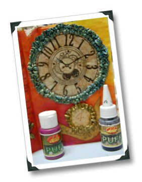
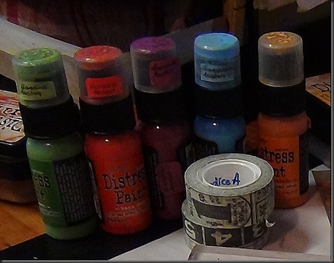
So true to form, it ended up being the case this month when I attempted the April Tag Challenge. I even had all the right colours in the Distress Paint line that he used, I had that Clearly for Art stuff, I had pen nibs, I had tissue tape and tiny staples that stick in the tiny attacher, I even had an unused strip of Alphablock letters that someone gave me(at least I think that is what it is called) – anyway this is what Tim’s tag looks like there on the top right.
And here below is what my April Tag wound up looking like. I kinda really like it though. And more importantly I had a lot of fun playing around with the patina technique.
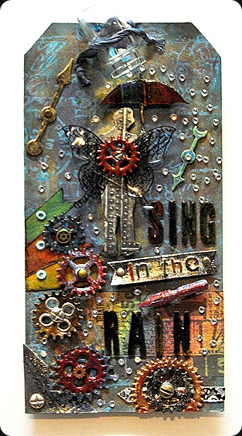 I really have to do something about getting/building/fauxing a lightbox so I can take better pictures of my things and I probably should also invest in a macro lens – but I keep buying shoes….),as well as learning better photography skills. In order to compensate for my inability to take a good photo – you may have noticed that I sharpened the image a little too aggressively and then I accidentally overwrote the original file so this is what I have to go with. You will be able to see better pics in close-up shots later on.
 I have always loved to blend paint because it makes me happy when I can get two crazy colours to mix (I know that’s a little weird, but hey to each his own blend of crazy right?) This new line of Distress Paint and the “wrinkle free” background technique that Tim made irresistably addictive to all of us – has taken my love of blending to the level of junkie. These paints are like ink, but they’re paint – its superbly liquid without being drenchy like a wash or a stain. And its opaque but like instantly blendable. And once it dries, it is completely permanent. I LOVE IT.
Then the extraordinary Mr Holtz went and brought out the Metallic Distress Paint and with it showed us an easy-peasy way of creating a Patina effect. So much easier than my old technique of painting on layers upon layers of different colours and topping off with a metal paint and then pain(t)stakingly sanding off bits to expose the different colours at different layers. That was super time consuming. And I am one of those instant-gratification type of people, so right now I am in faux-rusting ecstasy.
Anyhow, back to the tag that I am sharing – Here is a run down of what I did and used to make this tag.
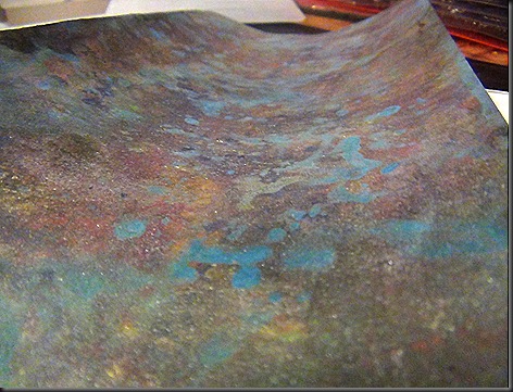
1. I started by going all blendy-patina like on a Manila Tag with a bunch of different colours from the Distress Paint line.
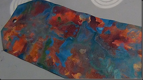 2. I cheated a bit on Metallic Paint bit, because they haven’t been released/sold in South Africa yet, so I used the Metallic Stain instead and blended over that with regular Black soot Distress Ink. I did that the usual way with the blender tool. The effect that I got by doing that was perfect. I really like that brushed metal kinda feel and I managed to get it just the way I like it. And then I made a little kind of stamp-pad right on my craft shhet with Mowed Lawn Distress paint and used the Carte Postale stamp. to stamp all over the tag. So there’s another thing that makes me love Distress Paint – you can stamp with it for a grungy, distressed impression.
 3. I then stamped one of my favourite Tim Holtz stamps – you know it – Umbrella man on a piece of grunge paper. I wish I had the Umbrella Man die, I wished even more because (as my friend Tracey from Tracey’s Treasures on YT) calls it “FUSSY CUTTING” the Umbrella Man so that I could make him pop was a right PITA. I embossed Umbrella man with the Riveted Metal folder from Holtz/Sizzix. I love industrial looking things. Then I painted him in black and put a generous helping of brushed pewter stain and pearl-ex over him. I used a combination of distress markers and Sharpies to add some colour to his brolly and extreme glossy accented. This is what he turned out like.
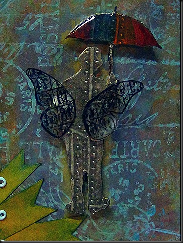
4. I stamped with the Bingo Stamp all over some butterfly wings which I cut out. I eventually used a different butterfly from the one pictured here above though as you will notice on the finished tag. And I heated the Clearly for Art stuff and just made them warp here and there a bit for dimension.
5. This is where it went nuts – all of a sudden I started seeing wet dripping tunnels with valves and the like, and that is the direction the tag took. I ran out of gears so I used chipboard pieces – and I also started trying to pull the colours together for balance. I knew that I had to use a pen nib as a nod to the original tag by Tim, but I also thought those game spinner thingies could be reminiscent of old-school gauges and pressure meters, and that would preserve the theme of my tag.
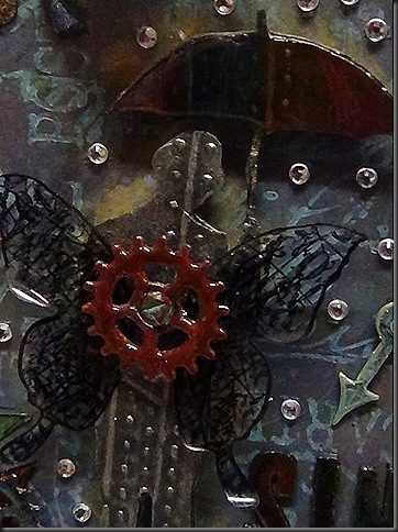 6. I developed the idea further from there – incorporated the pen nib as a kind of mechanism to direct the gaze in a kind of flow. I used tissue tape and distress inked to tie in the colour palette. I dont have the wordbands because they are chronically out of stock where I live like always so I cut out a simple banner and the words in “SING in the RAIN”. I have a thing for Glossy Accents – plus I wanted everything to look slick or wet. I discovered that applying Glossy Accents to wet Distress Paint yields some pretty cool effects. I painted the nib so that it would look like one of those old fittings that people just keep painting over and over again and I glossied that too. I distress inked the banners in Barn Door, Mustard seed and I think Crushed Olive on the side to contrast with the gears.
7. My favourite part of the tag were the blingy rain drops. At first I thought I might make little glossy accents raindrops and so I stuck on a few rhinestones to see how it would look, I decided that the rhinestones worked as raindrops and I would get to save my beloved glossy accents which is running low. Once I stuck a few on I then thought it would look super cute as if they were falling out of vial. So I distress inked some white ribbon in Chipped sapphire, threaded that through the little hole in the tag and then tied that around a little vial and then used Glossy Accents to secure it in place.

8. I didnt have any ideology corners so I made some with grunge paper (Grunge Paper is so darn brilliant) and embossed it with the Riveted Metal Folder from Sizzix and I added a star-screw brad just to keep with the whole industrial theme. I went a bit nuts with the gears there as well. I liked how it pulled it altogether though.
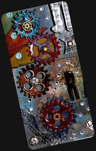
I wish I had better photography skills to show you how awesome this tag turned out in real life. The patina effect and the overstamping totally made it vibrate with energy – prior to that, I had always felt that my grungy backgrounds were a little too 2D. I do believe that I am hooked on this technique now. My style has never really been precise and tidy, maybe its a reflection of my personality – kinda random, all over the place and a little dark at times - so the whole grungy steampunkery thing really appeals to me – that or I am just stuck in the 90’s.
Hope you liked it!


