Wednesday, May 29, 2013

Some Tim Holtz style techniques and masculine cards


I always have a hard time trying to make cards and gifts for guys.  Even when you do a search for inspiration on male-themed cards your returns are standard fare – military, sailing, cars or tools right?  Does a masculine card really have to be limited to  neutral or muted colour palettes?   Are they really loving those golf-themed and fly-fishing efforts? I think we need more guys in our cardmaking circles to give us some kind of direction in the way of new themes for guys.  Luckily for us we have steampunk and grunge to shake up the mix a little – there are after all , only so many times that you can re-interpret a golf-ball image.
I thought that I would share with you an idea that I had for a unisex card.  I got to use one of my favourite paper-altering techniques (inspired by Tim Holtz of course) on it and my favourite hot-air balloon stamps.  I have never actually been up in a hot-air balloon, there is that pesky fear of falling out that I have to deal with – but I have always loved them.  So here it is – my attempt at a somewhat fun, colour-popping card that you could send to a male member of society, with the added bonus of a colour scheme that doesn’t rely heavily on dark muted tones.
 blogcards 031
For the background I used a piece of light blue cardstock, pulled out a bunch of my favourite balloon stamps and used a masking technique to stamp the images.  (NB:  make sure that you masking glue really is masking glue because I didn't use masking glue and one of the masks got stuck to the top balloon and ripped some of the upper layer of paper there).
blogcards 021While the masks were still in position I stamped over the masks with the clockwork machinery stamps in Sepia Archival Ink and then over that I layered some text stamps from a Chiswick collection.  I then used  Distress ink in Salty Ocean, Tumbled Glass and Broken China to add more depth and contrast to the blue background.
blogcards 022 blogcards 016
I removed the masks and used Distress markers and Watercolour Pencils to colour in the balloons – This really made the background pop and contrast.
blogcards 031 blogcards 024 blogcards 029
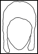
  Getting the pilot hat right was kinda silly –I took a couple of pictures of myself  in a long-eared beanie with my webcam to give me an idea of how  a 1940’s pilot hat would fit on a head.
Picture 39   Using that as my blueprint I did a rough sketch on Gimp to make it look more like a Biggles pilot hat and aviatorhatthen saved that outline to use as the cut-file on Make-the-cut (MTC from now on).  With MTC you have the option of pixel-tracing a JPEG and it converts into an SVG file ready for cutting on any plotter. I really like using these two programmes together.  If you do a search for Gimp brushes you can get a whole lotta images that you can use as digital stamps.  Once you import those into MTC – you can do some cool print and cuts with those saved files as well.
I used a Ranger product called Ink Refresher.  Tim Holtz demonstrated the potential of this product to create a leather look.  I originally used to use acrylic retarder to get paper supple and oily and leather looking, but I bought a bottle of this stuff to refresh my ink pads and decided to try the leather-look texturisation.  I was surprised – I had not expected it to work, feel and look any different to my acrylic retarder leather-look technique but I have to tell you – this product works so much, much,much better.  It makes the paper feel like soft suede and when you ink it for highlights and lowlights and crack burnishing it takes the ink really well without shredding the paper.  I love it.  To give the hat a little more worn and polished look I painted it with a clear acrylic varnish.
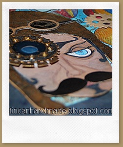
  I played around some more in MTC and drew some goggles and a couple of gears and a cool twirly moustache.
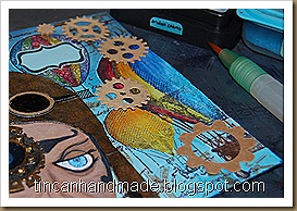
I drew in an eye, nose and mouth to the face and then added some steampunkery to the left side of the pilots face – I cut some of the gears and cogs on the card with regular dies (I think they were from X-cut – not sure now what brand they are because I store them unlabelled altogether)  and I cut the eye glass gears on MTC (you can make your own gears just by creative use of their inbuilt shapes and shape magic tools).  I stuck acetate to the back of the goggles and then poured in goopy White PVA glue and then coloured on top of that with a black permanent marker.
blogcards 025 blogcards 026blogcards 031 

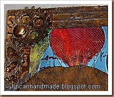
I cut out a rectangular frame and embossed that with a couple of different blueprint, industry and cogs and gears folders – I painted over that with gold and black acrylic paint and then ran some brushed pewter distress paint over it to make it look tarnished and brassy.
blogcards 031
I die-cut “WILD RIDE” out of the the Alphablock strip die from Tim Holtz alterations and stuck the R-I-D-E on a narrow chocolate popsicle stick.  Excuse the undried glossy accents there.
Here are some freebie cut files in MTC Format if you want to try make this pilot too!  I had to split it into 2 mats - It only contains the SVGs for the eye gears, the face, the hat and the goggles( all in multiple layers so you can stack them for dimension).  You can fully customise the face by drawing it in yourself and the background etc is up to you. If you want these in another format – shoot me a comment and I will see what I can do. 


Sunday, May 19, 2013

Tim Holtz Tags of 2013 – May submission

maytagI am a little late with my submission this time around.  It is nearing exam time for my students so I have been concentrating on that blog a bit more.  Also, I am a tweaker – I tweak at things until I get them to a point where I am marginally satisfied – I have a problem leaving things alone.  The good news is that I managed to stay somewhat close to the Tim Holtz design this time….with a few tweaks….okay maybe a few good more than a few tweaks. 
Mr Holtz bust out all my favourite colours this time around for his tag. So anyway – here is what Tim Holtz did on the left.  The challenge was to use his line of “Remnant Rubs”.  I loved the look of that tag.  Remember how In the 80’s it was popular to have a white background and then just a few key elements highlighted in neon hues – I love that he reversed that in this – where the key elements remain uncoloured and the background is all coloured up on steroids.  Here below – is my “rendering”.


th & mothers day 012e
Now for the tweaking bits.
  • I decided to use a Kraft Tag instead of a white one.  I love how Distress ink and stains look on Kraft.  It automatically renders a vintage quality to it. 
  • I do actually have the Remnant Rubs, I waited until I got them to even begin the tag.  Once I got them though and began the technique – I felt like, the vision I had in my head for the tag needed larger images than the size of the images on the sheet of remnant rubs.  The larger images like the flourishes didn't quite work with what I was seeing in my head.  So I cheated and used the stamp version of the images that I wanted from the remnant rubs. 
    But I still wanted to preserve the integrity of the resist effect that remnant rubs provide – so I decided to do something that I have discovered before when I wanted to create a resist effect.  I stamped the images in archival ink, let it dry thoroughly and then with a fairy sized paint brush – applied clear polyurethane varnish over the bits that I wanted.   I was happy with the look – remnant rub-ish enough!
  • I then inked with Distress Inks and Stain.  I wanted a sort of ethereal, glowy bit in the centre where I was going to ghost stamp one of the images from the Photo Set.  So I used some White picket fence distress paint and then stamped the image in Archival Black.  When I flicked water over that bit – it created white glowing star-looking blobs – SERENDIPITOUS!!!
  • To recreate the ripped off effect, I tore a piece of a post-it note to mask off a rip line (I am not sure a “rip-line” is a genuinely legitimate artsy term – but just if anybody hears it again – you saw it here first ;) )
th & mothers day 002 th & mothers day 008 th & mothers day 006 th & mothers day 017e
  • I like busy, floating texture on stuff – and in my opinion, my tag was looking too flat, even though I had ghosts appearing out of the cosmos in the centre of the tag.  I wanted more texture on the side of the tag, So I inked a piece of manila tag that I cut to a shape that I liked and stamped on that with one of the images on the remnant rub (i.e the text from the Visual Artistry Lost and Found Clear Stamp Set) and glued that over most of the Bingo image on the side.
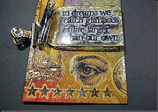
  • I felt it needed more interesting bits.  I had to work the filmstrip.  I don't have the Filmstrip roll as in the Idea-ology kind – but what I did have was the filmstrip stamp  (Visual Artistry Lost and Found Clear Stamp Set) and “Clearly for Art” Transparency film.  The moment I stamped the filmstrip on that (which was remarkably difficult to do because it kept sliding all over the place like the 80’s video tracer special FX), I knew that I wanted to roll up the film.  I honestly tried laying it down flat like the original Tim Holtz tag, but I couldn't, I really couldn't – I had to have it curled.  I heated it up and rolled it into a scroll and as we all love it for – Clearly For Art keeps its moulded shape as soon as it cools.  I attached the side scroll to the edge of the card with an Idea-ology hinge-clip.  I punched a hole in the other strip, added a grommet, and positioned it directly over the hole on the tag so that I could thread the fabric strips through it.  To secure it a little more I used some wonder tape on the back – to keep in the perfect angle that I wanted it in. I used a clock face (not a Tim Holtz item though – ssssshhhh – its from Chronology, and a washer and an Idea-ology pen nib because I frickin love those.  I love fountain pens in general.
th & mothers day 024e    th & mothers day 030e th & mothers day 022th & mothers day 028e
  • In my head, I already knew which quote stamp would match the theme of this tag – I wanted to preserve some of the “white background” look that the Remnant Rubs on white cardstock gave but I still wanted the ghostly people cosmos background to still be visible as a layer, so what I ended up doing was stamping the quote on a piece of acetate in Staz-on.  When it dried, I flipped it over and used a white French Manicure Nail Pen to highlight just the stamped text.  I like how that turned out – gotta do that more often.
  • The plain acetate looked a bit unfinished so I faux-soldered it with a line of glossy accents around the edges and then when it dried sufficiently to touch – I brushed Pearl-Ex all over it so that it would look like glass that has been gilded.  This turned out to be quite messy and I didn't manage to keep the Pearl-Ex on just the edges of the acetate.  Oh well, you win some, you lose some!
  • The left-hand bottom corner was looking a bit bare and it was crying out for something – so I put a splotchy blob of crackle accents on there and you know all the excess Pearl-Ex that was just hanging about the tag doing nothing useful but not exactly dusting off either, I dragged as much of it as I could down to the crackly splotch – that seemed to tie everything in.th & mothers day 010
  • I wasn't done with the texturing yet, it’s like how I tell my students to focus on the key ideas when they are trying to learn something instead of trying to recall every single sentence in the book, we needed a keyword here to create a focal point.  I really love those plastic idea-ology alphaparts – I cant stop myself from buying them and sticking them on everything.  In fact I have a grand plan to label all my cans and storage boxes with them.  So it is only natural that I reached for them to lay down the focal point.  I love how thick and dimensional they are – spiffy dahrlings!
th & mothers day 034e  th & mothers day 022 th & mothers day 005
  • I hammered some gold brads flat and stuck those down on the top left hand corner in a stripe. 
  • I cut two strips of calico and length of hessian string.  I distress inked one of the calico strips and left the other plain then I threaded all three lengths of trim through the hole on the top of the tag.
They say you should stop when you feel like you want to do just one more thing.  I ruminated about adding the enamel tag which I copied directly with the appropriate remnant rubs but when I tried to find a place for it – it just didn't seem to fit well with the overall look. 
And there it is – the May tag for the 12 Tags of 2013 Tim Holtz challenge. 

Monday, May 13, 2013

Cards, cuts and the amazing things you can do with MAKE THE CUT


On one of my pin-surfing trips this weekend – I found the most adorable French dresser type card that I instantly fell in love with.  http://pinterest.com/pin/78461218478519460
And Mother’s day was coming up and I still hadn’t made a card for my mama by then.  So I decided that this would be really cute to do and that she would love it because she’s a dresser kinda gal.  It was too cute and I had to try my hand at it.

Anyhow, I didn't have any cut patterns for the dresser so I turned to my favourite cutting programme ever – MAKE THE CUT and designed my own super cute French dresser with drawers. 
th & mothers day 017 (2)eI think I have  worked out how to  how to host and link a downloadable file on blogger (much love to Lindsay from the http://thefrugalcrafter.wordpress.com/
for showing me how to do this) – I am  making those cut files available to all you cool readers of this blog too so that “if you get the feeling” – you don't have to spend an hour searching for a cut file and then suddenly realise that you could just do it yourself on MTC, then spend another half hour drawing that.  It will hopefully be available right here:

- MTC Project file  Download link -
http://www.4shared.com/file/wSBrBGnr/french_dresser.html

- Plain SVG Download link -http://www.4shared.com/file/wSBrBGnr/french_dresser.html

If you don't have MTC or a digital cutter (which you really should if you don't because it is so stinking brilliant).  I am going to try and save the images in a PPT so that you can print and then cut out by hand – the layers are all so simple it is totally cuttable by hand even with those big, clunky round ended toddler scissors.  You may be able to find those here:
  
 - PPT Download link -

 http://www.4shared.com/office/ywj3h8gm/ppt_dresser_cut_files.html.  

Someone let me know if these links work please.

There are way too many cute ideas I have in my head right now that I could use this basic cut file for.  How about a mirror stand and some chairs?


I used a digital cutter to cut out the layered pieces,I cut it out of Flexoid – which is oil resistant gasket paper sold at a autoparts store.  My dad actually turned me onto this when he saw my grungepaper, and thought it looked really similar to gasket paper.  It doesn't work as well as grungeboard (being that it
wasn’t particularly designed for crafting, or to be be pretty) but it is a pretty decent second and I can buy it by the metre, which for me is like a present – I am a ridiculous bulk-buying freak.


th & mothers day 010
Anyhow, once I assembled all the layer pieces together – I stuck some acetate on the inside of the folded window pieces and then applied a super generous layer of Dala Hard Polyurethane varnish and Glossy accents -   I sort of wanted it to look like thick bubbly hand-blown vintage glass.  It didn't turn out the way I imagined but I wasn’t entirely displeased with the final effect.


Just before I folded the window layer – I painted the inside piece white with a light blue tint.  I then varnished the whole thing with Dala Polyurethane Hard Varnish.  It reminded me of those old cabinets and things my granddad used to have lying around.  My granddad was a carpenter and there were always crazy, cool things about his house, including various bits of furniture and pianos that he used to restore.

th & mothers day 012e

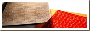
To make the background I used one of my favourite new Spellbinders M-bossabilites embossing folders that I got a few months ago.   They are dual textured embossing folders.  You just flip it depending on which texture you want.  This particular one is my favourite – it has a bark/woodgrain texture on one side and brick texture on the other on the other. Their designs are so rad.I distressed inked that in Fired Brick (naturally!) The hue of the Flexoid paper is sort of halfway between Kraft and Manila Tag, so the debossed contrast of the “plaster”is just perfect.    
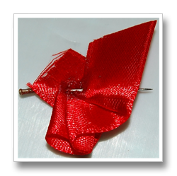
To add a little dimension – I sort of pleated and fanned out a teeny piece of red silk ribbon to make the burlesque-y secret spill out of the drawer.


I stuck a sewing pin through it to hold it in place and give it structure then poured on super glue to seal it. 

I used the wire cutting bit on a set of pliers to snip off the head and the point of the sewing pin.

Then I just super glued that down – I used some Chiswick adhesive foam squares to pop the top drawer out a bit over it.

For the assembly of the card, I folded a piece of kraft card stock, stamped all over it with one of the new line of Chiswick clear stamps in sepia archival ink and then cut a piece of black cardstock to provide the sandwich contrast between the fired red brick and and the neutral background of the kraft base.
  
I used the We-R-Memory Keepers Stub and Deco punch to clean up the corners and stuck those pieces together with snail adhesive from Crafter’s Companion.  I really like Crafter’s Companion adhesives, including the spray adhesive – It’s pretty strong and its reliable – I feel like I never have to worry about the nozzle gunging up or the snail runner slipping and stuff. 


The inside of the card was not too spectacular – I tried to keep it primitive – I’m afraid my obsession with gears and iron and steampunk love never quite left though – even though I tried hard to keep it in check.  Here is the crazy inside – just a few scribbles and I also wanted to test out these new Bic (kokies, if you’re South African – markers if you’re not) that I got at Dischem (???!??!) that have “INK EATER” markers.  I thought it might look kinda cool to have a zebra type print going on with the lettering – it was passable, it turned out looking much more doodle-sketchy than I intended….oh well…wasn’t that bad though.

I cant wait to play around more with this look.  I loved the contrast of the red brick and wood.  I think just a window with a funky blind against that brick background might also be pretty rad. The whole think made me think of those cool  old warehouses remodelled into bohemian apartments, that you would find in like New York, habitated in by hipster-trendy art people.   The  best part was that my mom loved it – I didn’t even put it in an envelope – I just had it hanging out on the front of the gift bag and it looked like it was suspended by the MOM bunting as well.  Super cool all around. 

So anyway that is it for now.  I’ll see what I can do about trying to upload the cut files.

Saturday, May 4, 2013

A few projects that happened in between

DSC_0072For some time now I have had the idea to create a bunch of different caricature type of paintings on block canvas that would be organised into a series. 
I wanted to do them in different sizes and draw or paint in different styles. 

Last year some time I came across an incredible comic book artist Brett Weldele on YouTube, who demonstrated how he paints with distress inks. I really wanted to try something like that.  I encourage you to go check out Brett Weldele - you can do that by clicking on his underscored there - he is super incredible.

DSC_0085Now whenever I build up the courage to attempt to paint I normally use acrylics, but lately I have been loving how easily I can get distress inks to blend and move and react. So when Tim Holtz introduced Distress paint, which kinda married ink and paint and allowed paint to behave like an ink – I knew that I had to see what I could get it to do.  I also had a bunch of distress ink markers, and I figured that they would be perfect to add detail with. 


Recently when I purged my craft room/office and discovered that I had a bunch of unadulterated block canvas in odd sizes. I decided that I would try the caricature series idea and see how well I could get the distress inks,paints, stains and regular craft acrylics to work together.  What a brilliantly fun experiment this has been. 

 It’s not only about how incredibly well all those pigment mediums did work together but it was draw-ainting (yeah – I made that word up DRAW+PAINT)that was totally fun too. 

DSC_0088The thing about doing caricature style paintings is that you don’t have to be very good at drawing or painting to do so, if you can get the slightest of resemblance right – you can happily make yourself believe that you are drawing caricature portraits of yourself.  

I did about four super quickly this last week or so – I am still not sure whether I want to leave them as is or alter them a little and make it more mixed media pieces, you know like adding the odd flower, gear,keyhole or tissue-tape.  And….I really feel like I want to glossy accent the lips and eyes.  I could throw in a few random inspirational quotes here and there.  I don't know – what do you think?  I am leaning toward altering them though, because embellishing stuff with random elements is the correct way to live, it is written there in an ancient book of wisdom – I’m telling you – totally true story.
DSC_0047

Today’s other happy thing was that the order that I put in at Scrapworx (my local Tim Holtz/Ranger stockist)for the Metallic Distress Paints came in.  I have another idea to do a celestial type painting and I am pretty sure those metallic paints are going to work out perfectly for that.

Friday, May 3, 2013

I made the TIM HOLTZ 12 Tags April list – WOOOOOOHOOOOO!


I don't have a bucket list yet, but if I had made one, one of the things that would have been on  there was to get a mention on the Tim Holtz blog.
I have been going on and on in older posts about how much I wanted to be on that coveted list of winners but given the amazing amount of talent submitted – I never truly expected that my crazy attempts would ever make the cut. 

So I was a little confused when my inbox for comments on my blog started saying – “congratulations on your win”.   What win?  What competition? Wait, these are comments on my rain man tag – OMG, did I get mentioned on the Tim Holtz blog????  I saw that he had a new 12 tags post and then I just held my breath as I read through the post and then down to the April Winners – OMG, OMG, OMG – my name is on the list……

I was so excited I nearly fell off my chair, for real.  I clicked the link so many times to see if it was really linking to my tag.  The rest of the day was spent in a giddy state of disbelief and excitement.


The thumbnail image in the Tim gallery was kinda crazy looking to me, and I knew it didn't resemble the original Tim tag at face value so I never even imagined anyone would feel motivated enough to click it.  So when  independent bloggers, clicked and commented on it even before the winners list was mentioned on Tim’s blog I was already uber thrilled.  For me just that was enough to make me feel great!

Congratulations to all the winners on the list as well.  It was pretty cool discovering that almost all the ones that I loved made the list as well.  When you look at the gallery of submissions, it is totally inspiring – everyone is so gifted in their art. I would never be able to choose a limited amount of winners out of all the fabulous entries.

Thank you so much everyone over at the Tim Holtz franchise for choosing my tag as one of the winners.  I am more than thrilled, I think this is a kind of high I wont come down from for the next whole month. 

The prize is like the best type of prize to win – a chance to shop at Inspiration Emporium and it is for a generous amount, I am already drooling at the amount of stuff that I am going to get.  I cant wait to get my grubby ink stained fingers on all of it.  Also I got sent a cool badge to put on my blog – so now when anyone comes over to the Tin deli – they see that – how cool is that?  Is there anything more validating and cooler for a crafter than to have a badge that says “TIM HOLTZ LIKES ME” ???

Anyhow – I am over the moon and on my way to Mars right now – that is how high I am floating.