Thursday, May 29, 2014

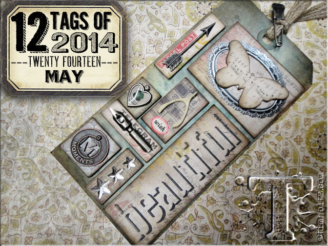
Tim Holtz 12 tags of 2014 May


With 1st Semester exams underway for my students, my time has finally freed up a little for me to devote some much craved for time to make my “tag” entry for the May 2014 edition of the Tim Holtz challenge. Over there on the left was what the talented Tim challenged us with.The focus was on using all those ideology trinkets that we all love to collect and framing them on little paper tiles.  He also showcased the new shadow embossing folders there on the bottom right.  Those haven’t arrived in my part of the global woods yet so I had to change it up a little.

002
For this month’s “tag” – I decided that I wanted to make something more functional than a tag. Father’s day is coming up and that requires an awesome card for Dad.  I put tons of work into this piece inspired by the TH May because I have a brilliant dad who deserves every bit of detail and attention and coolness.

DSC01804
I also got inspired for the design of this tag by how much I loved the effect of the pipes in my previous post (Click the grey text to go there -the rosey pipe-line for Linda Ledbetter's CC3 Challenge).  I decided to mess around some more with pipe configurations and I really love how this card turned out.  I think my dad is going to like it too.

dazzle_stencil_4f538b4f97610__42366embossing folder pics
For the background of the card I used the diamond plate from the diamond plate and riveted metal texture fade set by sizzix and the Brick wall stencil from Enmarc. 

Making the glazed brick texture was one of those salted UTEE experiments.  I inked through the Brick Wall stencil with Archival Ink first in Monarch Orange and then lightly in Plum and then with my salted UTEE heat embossed. 

DSC01800DSC01803

The effect it created was a lovely, rough and sandy looking glazing.  I have to remember this trick for later. Over that I layered the riveted metal piece that I painted with distress paint.  I wanted to create the effect of an industrial basement in a building with some exposed face-brick wall and valves and gauges and pipes.


001.e


To make the pipes – I did the old drinking straw trick again – you can find out how I did that in the post that precedes this by clicking here: http://tincanhandmade.blogspot.com/2014/05/everything-is-coming-up-roses.html


008


I used a variety of Ideology tinkets and the Gears Die to embellish the tiles.  The tiles are cut from a variety of Tim Holtz papers and I stamped on some of them with some industrial blueprint looking stamps from the Tim Holtz Stampers Anonymous Collection.

007

So I think I kept the theme of the May challenge – don’t you?  I’m entering it as my version.  It is all about what those tag challenges inspire right?  Hope Mr Tim doesn’t mind that I didn’t make a tag.  More importantly – I love that this is going to be dad’s father’s day card – getting all those straws etc. to glue and stay glued at the proper angles was a proper mission, I fiddles with the details for hours.  Dad is the only guy who can be trusted to treasure and appreciate all the work and of course all those lovely ideology trinkets!


Everything is coming up roses


005I have had really good intentions to enter Linda Ledbetter’s Compendium of Curiosities 3 challenge.  I just never managed to find the time to sit down and make something.  However – when I saw Challenge 3 – I knew that I had to do this one atleast.  If you dont know about the challenge, here’s a little link to the rules of  engagement http://lindaledbetter.com/compendium-of-curiosities-3-challenge-faq 

The current challenge is to use the faux tea-rose technique on page 65 of Volume 3 of Tim Holtz’ Compendium of Curiosities.  I had loads of those left over when I did the April Tag for the Tim Holtz 12 Tags of 2014 challenge and I have been dying to try out an idea I have had in my head for a while. 

I saw these metallic drinking straws on Amazon and in my head, I saw metal pipes. I wanted to make an industrial type looking thing with pipes and gears and taps (faucets)  When I saw what the CC3 challenge was about this time – I immediately had a vision of a rose pipe-line.  And the idea gave birth to this piece above.  I love how it turned out – I really want to explore the pipe-potential in different configurations now.

To make the pipes – I just took ordinary drinking straws and painted them with distress paint and then I cut them to the sizes that I wanted. The faux tea-roses ofcourse are cut with the die mentioned in the book.  A cool thing I have been doing recently is cutting off the last few petals on the spiral – that gives me control over the size of the roses.  

The background is just a piece of cereal box board that I painted with gesso and then distress paint and the goldleafed a little.  I accidentally discovered a DIY way to make goldleafing – will write a post on that sometime soon.  I drew the black- lines in real hard to create the effect indentation with the aim of making it look like shingled planks.  I know this challenge is really about the faux tea-roses but all I am obsessing about right now are those cool pipes – the industrial/grunge/steampunk loving crafters will understand that.  I am going to have to make many more pipe-lines in the future just to get it out of my system. I think I am going to pipe-out my tag entry for  the 2014 12 Tags May Tim Holtz challenge as well.

Wednesday, May 21, 2014

BOXING WITH TINCAN (*sorry about the weird layout - cant figure the fix)


001001My dearest Chairman Mau has a shop in the Drakensberg (KZN, South Africa) called Living Art Gems at Thokozisa Centre near Champagne Castle and Cathkin Peak and if you love interesting places filled to the brim with handmade crafts and crystals and gems and if you find yourself in this area– this is the place to go. (Shop 6 – Thokozisa)

004The Chairman knows a  win-win situation – he gives me a set of these blank boxes and says that I can decorate them whichever way I felt like to sell in the shop.  

Oh what manner of joy is this?

010I am kept entertained, blissful and thrilled at the chance to colour like a 4 year old who has just discovered paint and by distracting me like that – he wins double, as by default I am  less prone to be bratty and maybe that serves the purpose of me being a little more manageable for him. 
Chairman also scores by getting some more craftsy things to add to his shop inventory.

I used a bunch of different colouring tools on these boxes .

026I primarily used Ranger Alcohol Ink to colourwash the boxes. Tim Holtz gave me the great idea of putting drops of alcohol into a palette and letting that dry then using a blender pen with blending solution or in my case a water brush filled with blending solution to pick up some of dried colour to stain the bland boxes.  You get really bang for buck that way – you really would be surprised at how far that one drop goes when stretched out with alcohol.

012I also coloured on them a bit with alcohol based Permanent Markers and I used Sharpies and Bic Markers – oh horror go the elite crafters with their Copics and Spectrum Noir sets. 

To be truthful, there are a lot of things I do with ordinary common kids craft supplies that are not the exclusive craft inventory that are sold as essential elite craft supplies. Like the other day I saw a kit of regular run of the mill glitter branded with the label of that lady with those TV Shows in one where she makes things and the other where she fires people and it was priced at nothing short of extortion! I was like no wonder the lady did some time in the Big House!!!! I can get the more of the same thing in the kids craft section for a 100th of the cost.


016I did crumble and order me a set of a set of 36 Derwent Inktense Pencils – oh my – can a pencil get any awesomer??? I have been wanting them for ages.  They are highly pigmented and move like watercolours when “wetted” and they dry permanent.  Not only that but you can also draw on canvas or fabric with them.  I think they rock. I colour-painted on the boxes with these sweet babies too.

006I stamped on the boxes at first with Stazon, but my black Stazon ink pad is so dried out and non-usable that I gave that up after a few not so fresh impressions.  Bring out Ranger to save the day – the Archival Ink worked like a freaking dream.  Ranger is the one brand that I dont ever have buyer’s remorse or frugal-attack over.
021008 

I am not paid by Ranger nor do I get any stuff from Ranger – so this review is purely based on my experience of their consistent quality, versatility and ease of use within their product-line.  Their inks and dyes and things last forever.  I have Distress Ink pads that sat with their lid off them for about a month that are still juicy and vibrant. 
023

Archival Ink, is not as sticky as Stazon but you can pretty much stamp onto anything with it, and if you heat-set it – you get a semi-permanent impression.  I never ever wash my boxes or cards or tags – so I dont need them to be as permanent as the pyramids. Ranger Archival Ink is my go-to ink if I want an impression that is hardy.  So while I did go on a rant about that lady’s glitter pack earlier, I dont mind spending money on the Ranger line, and I do make exceptions about buying more exclusive supplies when they perform above and beyond the call of duty.
005

I am not sure the Chairman knew that when he gave me those boxes to mess around with, that it would be a true game changer and that life as we know it would irreversibly shift.  I have decided that all I want to do in life, well at least for the next few weeks is paint and stamp on boxes. 


Friday, May 2, 2014

Woohoo - I got a 12 Tags tag!

I'm so thrilled and honoured to have made the April 2014 Winners list for the Tim Holtz 12 Tags challenge.  What made it even more cooler was that last year in April I made the Winners list then as well.  What a fabulous surprise for that anniversary.

I am on holiday for a week so that makes the whole Tim Holtz surprise even better.  Let me show you what I have been up to.

The chairman and I checked out Lilani Hotsprings near Greytown earlier this week.  Apart from the sulphury smell (as is to be expected), it was fantastic.  We both decided that our skin felt so much better afterwards and it was worth the rotten egg fragrance in our hair!

We have since returned to the Berg, it is going into winter here so the days are brilliantly clear.  The sky goes a cerulean blue and the contrast of the mountains against it is jaw droppingly beautiful.


Yesterday we went to visit some friends who run the Graceland Bed and Breakfast in Champagne Valley and we all went down to the river on the property.  I love how everything here is completely untouched by people.  Its been ages since I went down to a river bottom and not seen the river bank strewn with litter.  Little Maya, who is the most adorable, feisty, little 2 year old daughter of Ruth and Barrett whom we went down the hill with - stripped off and promptly declared "Me jump"!  Which meant she wanted to swim in the river.  Brave little girl that she is, she jumped right into the freezing water and splashed around til she declared "Me cold" and "Me towel".

Right now in the Berg is the Drakensberg Boys Choir School's annual Music in the Berg.  I am wanting to go, but the chairman, who is an DBC Alumnus is not interested....maybe I can convince him to....will keep you posted.

Monday, April 21, 2014

Tim Holtz - 12 Tags of 2014- April entry


DSC01744Well hello bloggerkins’

I am 10 days shy of the deadline again.  I have excuses but more about that later.  Let me show you my April 2014 entry.


There are only a few tags and pieces that I have created that have escaped my habit of excessive judgement and catapulted straight into my ideal of awesomeness. This tag is definitely going to be one of them. It was so fun to make and it turned out so beautifully that even though I made it as the front of a card – I dont think that I am going to give it away, I dont actually know what I am going to do with it – but I am going to keep it all for my selfsome.


 It involved glossy and crackle accents, splashing paint, and some Macguyvering.  I think I might have also unintentionally developed a concerning crush on washi tape in the process. 

DSC01743

Anyway, my interpretation of the Mr Tim’s inspired work this month, took flight from this one simple image from the line of stamps that was featured in last month’s tag challenge. 


I stamped it onto stamping paper cut to 1/3rd of an A4 sheet, I am all about those tall trifolds right now.  Ranger Inkssentials Specialty Stamping Paper is my new favourite medium to work on.  It kind of looks and feels like shoe-filler board.  But don’t be fooled - this stuff is bloody awesome and will make you buy shoes just to see if you can get the same effects from the shoe-filler (ask me how I can vouch for that?). I swear on every Sizzix die that I own, right from your juicy stamp not sliding at all, to how it reacts with dyes, chalks and paint to get fantastic textural and special colour effects, I have never met any undesirable moments with these sheets of pure brilliance.  DSC01748


I don’t love the Pinecone die as much as I love my other ones.  Firstly, I think I have a defective die cos it doesnt cut all the way through on the last 3 outside petals of the spiral. There unfortunately was a stupid thought that I could remedy the no-cut woes by “tempering” the die with one of my Spellbinders Tan embossing mats.  BAD MACGUYVER MOMENT!!!  I now have a curious tan siliconey rubber pinecone spiral.

DSC01752Eventually, I realised that shimming in just the right outside petal spots with folded newspaper pieces makes the die even enough to cut a perfect die-cut.  

Secondly, have you ever met anyone with infinite amounts of  patience to roll up loads of those pine-rones (Yes I just made up that word – work it out – you’ll want to say pine-rones too, I promise, seriously, do it, do it now……see……)?  Having said that – I forced myself to engage with the die and made a whole lotta pine-rones! Look there on the right and below that on the left – you know why?  Cos I ‘rone like that!!


DSC01756I bought these Idea-ology tag fragment thingies ages ago and never got around to using them, so even though I have those metal word tag token thingies – I decided that the sentimespiration (Yup, invented that one too)would be this month’s test of “use-your-holtzings-in-different-ways” personal challenge.  Love how this turned out darlings…. I love Ranger’s Archival Ink to stamp on anything – more than I love that other brand that promises to stick on anything, you know the one, the ones where they dry up real quick and stays on things you dont want it to stay on, and stays off the things you want it to stay on.

DSC01753

I think making the branch look all gnarly and dimensional was defo a highlight for me too.


I had fun with the Frameworks die-cuts too. DSC01750Some Macguyvering there too, but good Macguyver had come out as the dominant personality this time.  Did I say that I loved making this tag yet?

DSC01740
DSC01736
I confess that I haven’t been around to everyone’s of late.  In my real-life I sometimes have to put in extra attention to my work at my day job.  Recently I presented a paper at the UJ Phenomenology and Naturalism conference in Johannesburg and I kind of got distracted with getting that into shape. 


I do not like Jo’burg city in general, whenever I am there I always feel like I am looking in on the set of some kind of Dystopian Novel turned into a movie-set.  But I may be biased because I grew up on one of the Tropical Coasts of my country, and I way prefer my lush part of the world with minimal concrete and it’s natural beauty to the concrete jungle of the Goldmine City.   What I do love about Jo’burg though is it’s amazing twilight and dusk sky. Check this picture out that I took from the balcony of the place that I was bunking in for the duration of the conference.  Isn’t that just a Distress Ink Palette?  Going to have to do something with this skyline and colours soon.  That’s it for me today – catch you soon…ish!

Sunday, April 6, 2014

Artful Dwellings Altered!!!


DSC01715I collect them you see, like a sick collector.  I buy them and then I get like all precious about them.  So you know how like Comic book collectors have comics from the 1950’s still in their original packaging?  I get that anal and holy about my Tim Holtz stuff. 

To be fair to myself, it’s not entirely all nerdy-geek sacrosanctity.  There is a legitimate economic consideration – owing to the Rand/Dollar exchange I pretty much have to drink cabbage soup for the rest of the month whenever I do a little “Holtzbinging” which then make these items the more financially valuable items I own.  Seriously, they are on the same level of parity to bottles of perfume and 14K jewelry.  There are large appliances in my house that are worth less than my Holtz collection.   

But I digress.  Back to the story – I noticed the other day, after Chairman Mau had installed some shelves in my office, and I felt the need to put stuff on them, that I had all these lovely virgin dies. 

See, I would bring them home, but I would feel like using them right away to cut through hard cardstock and vividly busy patterned paper would just be wrong – like an insult, an affront to their dignity, a blatant disrespect for their reverent selves.  So they would sit, I would feel like when the time was right, I would have that devout conviction in my heart that it was time.   Chairman Mau had spent the whole week doing major house alterations in my dwelling and turned it into something artful.  The time had come. All the signs were there. That for me was the unchallengeable silent whisper that it was time to use the Artful Dwellings die.  

But like when you go on some insane juice only detox cleanse and then when it comes to the day you get to eat solids – you binge on all the cake, cheese, biscuits and icecream in the store – I went a little nuts and overcompensated for my asceticsim regarding the dies – I even altered the die-cuts.  I cut out all the lovely whole shapes, then I wanted to turn them into little houses, so (“gasp, shock, horror”) I cut them up, and then cut those pieces up even more so that the roofs looked like roofs and the walls looked like walls.  To add insult to this irreverence – I even went in and inked those bits up in loud, loud colours.  I inked all over Mr Tims lovely designer paper, I stamped on them, I even embossed them -----Lord have mercy!!! 

You would have thought my insolence would have stopped there – but no – posessed by a demonic alteration spirit, I went and busted out the Hanging Sign and Hardware Findings Dies. I freakin’ cut those up too!   I was watching Once Upon a Time while all of this was happening – which may or may not explain why the design turned out like the cover of a storybook.

A few things that I discovered along the way apart from the fact that “magic always comes with a price” and that when the Chairman Mau calls me “dearie” I want to call him “Rumpel”.  If you unravel bits of paper rope, stick it down in all its unravelled but crinklyness, and your distress ink it madly with a bunch of different colours, you might end up with a cool woodgrain texture –

TRUE STORY – look here on the right –>

I wanted the wrought iron to look wrought and hammered and like it is about to break out into orangey rust song. So I sprinkled some medium grain salt into some distress embossing powder.  I mean if I am going to be altering the integrity of products – I am going big, nothing in small, controlled measures for me baby!  I love the regular distress embossing powder – but the salt addition just made it ever so slightly distress-ier.  Liked that – got to remember to do that again.


For the inside of the card –DSC01723 the sentiment is related to the spirit of the house alterations the Chairman has been doing and the gentle way he has encouraged me to  mentally/spiritually “evolve”,let go and faith forward toward love and living. 

My new favourite distress effect thing to do is to stamp stuff in Archival Ink in the same tone as the that which I am DSC01724going to blend around it.  I then roughly paint over that in clear gel medium – trying to get in as much brushstroke around the edges as possible.  Then I go all out with some serious Distress Staining, Inking and spatter brushing.  I really love this effect.

For the personal message part that I was writing on, I got a little philosophically artsy- fartsy. The idea was to distress ink in happy, bright, contrasty colours, the “Cracked glass”  Stencil from the Holtz line (YEAY – Still so excited that I got me some Stencils) to signify the moment of moving from broken toward brighter, happier things.


Thursday, March 27, 2014

TIM HOLTZ MARCH TAG 2.0– I got me some stencils–yeah baby yeah!


march2fullsmlSo Mr Tim was in the country and did a retailers workshop and he brought with him some stencils.  Now I didn’t get to confiscate his luggage at the airport like Toni suggested I should, nor did I get to go to the workshop because it was too far away from where I live and I had work commitments among other things and so I drooled as my Holtz-happy friends Venesia Ramsey, Ethne LeRoux and Pamla Nagappa tweeted a running commentary on all the fun that they were having there. 

When Venesia and Ethne returned – Aunty Ethne sent me a lovely message saying that they had brought back a whole bunch of stencils (previously unavailable in South Africa) and that she had kept a set aside for me to get first dibs on.  I LOVE AUNTY ETHNE! 


 So I flew out of my office the quickest that I could and went around to get my greedy hands on some stencils.  So long story short I HAVE STENCILS – not just any only stencils – the bonafide Tim Holtz release of stencils.  Ofcourse now I am going to have to remake the March Tag because I have everything needed – the Sprtizer, the stencils and more importantly – the enthusiasm!!!!


handSo here is the March Tag 2.0.  Its the version that uses all the legitimate supplies like the proper stencils and the spritzer.  Had way too much fun mucking around with this – I just had to post!  I am going to submit this one too to the TH BLOG for March – am I allowed to do that?  I mean can we submit more than one project, it turned out so brilliantly I think, I really, really want to share it.  Yeah, I think I am going to post it - they will kick me out if I did do something naughty.
  
Some details that I was super happy with were the triple stamped feather, all slightly offset by a few micromillimetres and the white shadow-stamped.  Loved how it gave it shadow and more dimension. 

I liked it when I accidentally tried to clean up a spatter brush leak under the stencil by water-brushing it and it created a yummy watercoloured blending that made both the stencilled spatter pop but also made the hand the key focal point.


fig details

I love the shadows here,  I stamped on acetate and used some some gold paint to paint the enamel dots.  It reminds me those little glass plaques they have on displays at museums or those kinds of places.
creating tab


I washi-taped and baker’s twined and hemp twined to draw attention to the wordband.  I swiped on Salty Ocean Distress Paint over the top and then cleaned off where I didnt want the paint to go.  I liked this particular band because “Chairman Mau” have spent a few good hours talking about self re-invention and learning to be the better versions of ourselves.


egg


I think the Glossy Accented speckled egg and bug wings were my favourite bit of this tag – but that could very well be more about my obsession with Glossy Accents than anything more profound.


I am giving this tag to the “Chairman” ofcourse – because of the sentimentality of that wordband – “Life is about creating yourself” and also because he just spent the last couple of days doing all kinds of handyman jobs around the house, for free, cos he’s lovely like that.

035shelfsml032