Thursday, March 27, 2014

TIM HOLTZ MARCH TAG 2.0– I got me some stencils–yeah baby yeah!


march2fullsmlSo Mr Tim was in the country and did a retailers workshop and he brought with him some stencils.  Now I didn’t get to confiscate his luggage at the airport like Toni suggested I should, nor did I get to go to the workshop because it was too far away from where I live and I had work commitments among other things and so I drooled as my Holtz-happy friends Venesia Ramsey, Ethne LeRoux and Pamla Nagappa tweeted a running commentary on all the fun that they were having there. 

When Venesia and Ethne returned – Aunty Ethne sent me a lovely message saying that they had brought back a whole bunch of stencils (previously unavailable in South Africa) and that she had kept a set aside for me to get first dibs on.  I LOVE AUNTY ETHNE! 


 So I flew out of my office the quickest that I could and went around to get my greedy hands on some stencils.  So long story short I HAVE STENCILS – not just any only stencils – the bonafide Tim Holtz release of stencils.  Ofcourse now I am going to have to remake the March Tag because I have everything needed – the Sprtizer, the stencils and more importantly – the enthusiasm!!!!


handSo here is the March Tag 2.0.  Its the version that uses all the legitimate supplies like the proper stencils and the spritzer.  Had way too much fun mucking around with this – I just had to post!  I am going to submit this one too to the TH BLOG for March – am I allowed to do that?  I mean can we submit more than one project, it turned out so brilliantly I think, I really, really want to share it.  Yeah, I think I am going to post it - they will kick me out if I did do something naughty.
  
Some details that I was super happy with were the triple stamped feather, all slightly offset by a few micromillimetres and the white shadow-stamped.  Loved how it gave it shadow and more dimension. 

I liked it when I accidentally tried to clean up a spatter brush leak under the stencil by water-brushing it and it created a yummy watercoloured blending that made both the stencilled spatter pop but also made the hand the key focal point.


fig details

I love the shadows here,  I stamped on acetate and used some some gold paint to paint the enamel dots.  It reminds me those little glass plaques they have on displays at museums or those kinds of places.
creating tab


I washi-taped and baker’s twined and hemp twined to draw attention to the wordband.  I swiped on Salty Ocean Distress Paint over the top and then cleaned off where I didnt want the paint to go.  I liked this particular band because “Chairman Mau” have spent a few good hours talking about self re-invention and learning to be the better versions of ourselves.


egg


I think the Glossy Accented speckled egg and bug wings were my favourite bit of this tag – but that could very well be more about my obsession with Glossy Accents than anything more profound.


I am giving this tag to the “Chairman” ofcourse – because of the sentimentality of that wordband – “Life is about creating yourself” and also because he just spent the last couple of days doing all kinds of handyman jobs around the house, for free, cos he’s lovely like that.

035shelfsml032

Tuesday, March 18, 2014

Masculine Card–Share 2


They say technology has brought the world closer. I can video chat in real time with anyone half way across the world at will.  I know exactly what some facebook acquaintance has had for dinner (with a picture). I get a blow by blow account of  how someone’s #baby-is-throwing up on #twitter.

Sure, these are great conveniences, it is awesome to be in instant touch with your friends and family and share information and sure, sometimes it maybe a little too much information – I have never been able to make myself have a dignified, undisgusted reaction to people sharing ALL parts of their bathroom experiences publically on social media (I am not even kidding about this). 

So despite the pros of instant electronic communication and connection – I have to admit that I am still a huge fan of old school, snail mail, or hard copy post.  I love getting letters and cards in my little post box.  I decided that I have to single-handedly start a old school post preservation revolution and send hand written letters and cards to people I care about. 

DSC01655 I decided that my first order of business was to send one to the lovely “Chairman Mau” – I have blogged about the fabulous “Chairman” and how much I totally adore him before.  I mean seriously, I couldn’t not adore someone who will strike this face-pose with me in photo solidarity???? I really love people with a great sense of silly!

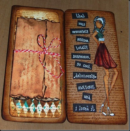
Did I mention that I also want to revolutionise my thematic staples for masculine cards?  In I put this together – and haven’t put it in the mail already – so I hope the Chairman doesn’t read this post before he goes to pick up his post at his postbox – it's going to be a surprise.

It’s a skinny tri-fold of A4 sheet.  I have a thing for Kraft cardstock so there it is.
Card front 001I finally played around with my Prima Doll stamps. I coloured them in with Distress Markers and watercolour pencils from Derwent. I took the liberty of altering the hair a bit to look a little more like me...

The card folds out to reveal two panel and then three panel layout.
002

I left one of the panels un-imaged so that I could write a more personal letter and attach it to the card.
006

This was an attempt of a merge between a uniquely personal and yet humourous card.
004
I didnt have a cheese stamp so I just drew it in with Distress Markers – and waterwashed around it to give it a bit of a frame.
003
I handwrote the “in-joke” sentiment/message with a Sakura white gelly roll pen on lightweight black cardstock.  

 What do you think? Who says boy cards have to be all tools, cars and gone-fishing like?

NB:  “Bosphorus” is one of those “in-endearments”….in case the grammar nazi in you is scratching your head!

Saturday, March 8, 2014

12 Tags of 2014–March and the Spritzer


034So Pinterest has become my Holy Grail of all types of inspiration and  innovation.   I have discovered a fantastic new “tool-set” in it.  I get a little anal about keeping things fresh and interesting.  The thing is, I am a chronic Distress Ink buyer….so I might have a pretty big collection of it and yet I find myself using the same old colours over and over again.  This doesn’t bode well in the quest to be fresh and interesting.  A while back I decided to start pinning colour schemes for rooms in my house I wanted to paint and then decorate.  I   clicked on my colour palettes board a few days ago and I had the equivalent of a crafty burning-bush episode – I thought to myself “Holy Moses – these schemes totally work for tag and card colour scheme inspiration”.  

So I have decided to pick one and go with it – for the Timmy Tag as well as whatever else I feel inspired to create this month.


I went with the first image that appealed to me and it happened to be this palette over here on the right.  Easy peasy Distress Ink squeezy?????  I figure all I have to do now is match up the Distress Inks to the closest approximation to the colour swatch right?  I dunno, let’s see what I can match up – here comes my next new tool – the Distress Ink Colour chart. 

030So I am thinking I need to pick Spun sugar, Picked Raspberry, Peacock Feathers, Tumbled Glass/Broken China and Gathered Twigs or Walnut Stain – maybe??? 


Now – I am going to choose a stamp set to attempt this month’s technique – SMUDGE STAMPING and DISTRESS SPRITZING. It doesn’t hurt also that I have the Alterations Movers and Shapers Tattered Leaves Die set, for you know….if I want to add some texture or dimension.  I seem to be incapable of not adding some kind of 3D dimensional element to anything that I do.

Anyhow – let’s see how this goes.

I smudged stamped the big leaves and then coloured them in – because they were too contrasty with the the subtle smudge stamped effect outline, to blend in the muted tones I wanted – I washed out the the colour with a waterbrush.


tagtim03.1
I made my own stencil once again with the brick texture Strip die from Sizzix and used my new Spritzer.  Have to admit that I still trying to get the hang of it but I love the effect despite my clumsy attempts to confine the spray pattern to where I wanted it to go. I made the little Robin’s eggs out of airdry clay and spritzed that for a speckled egg look and then I glossy accented that. I added a few twigs here and there as well.
I am happy with how this turned out.  I am unusually into pinks and blues these days – dont know for sure why but I do suspect its because I am feeling very feminine and loving my femininity at the moment.